A perfectly coded website will still break down if the content isn’t written and built accessibly. This article is intended to give a no-coding-required breakdown of how to make accessible content.
I’ll use WordPress as a basis for examples when relevant, but the same principles apply to however you build your website.
Use Headings
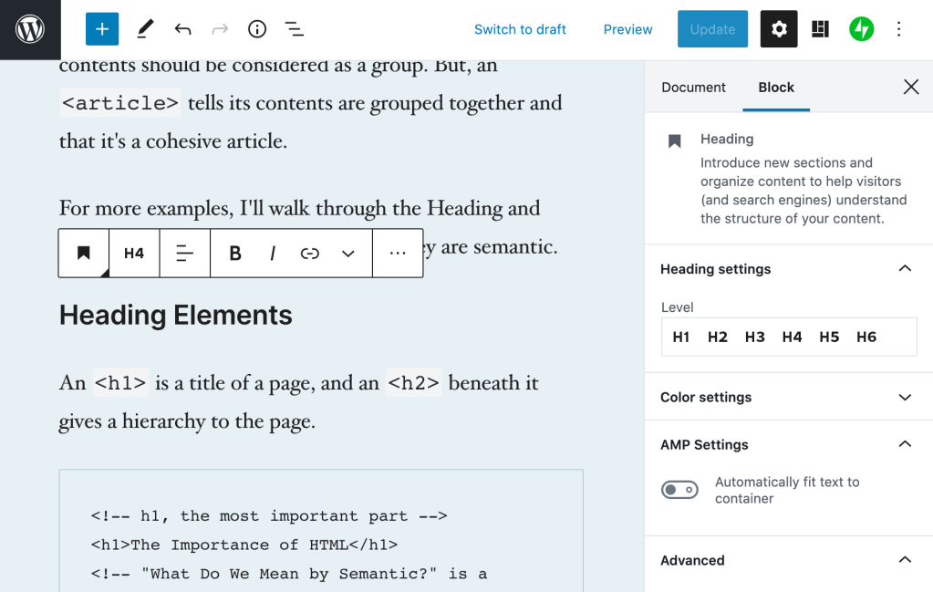
Headings are the titles within your page. They go in descending order from an h1 (heading one) to h6 (heading six). An h1 is the most important, h6 the lowest heading.
I think of headings like they’re used in a book.
- Book Title,
h1: The most important. - Chapter Title,
h2: The second most important, gives context to where you are within the book. - Subsection Title,
h3: A section within a chapter, and so on.
When writing content, you can structure your website using the same idea in order to give people an overview of your page.
Tips for Headings
- There should be only one
h1per page. This is generally your article title. On your homepage it may be the name of your site. - Headings should follow a descending order and shouldn’t skip a number. Here’s what your heading structure on a page might look like:
h1h2h3
h2h3h3h4
h2
- You will rarely need an
h5orh6
In The Importance of HTML Headings Section I go over in more detail why Headings are important for accessibility.
Consider How The Content Would be Read Aloud
When people use a screen reader, the content is read to them from top to bottom. There are some things that can get annoying, quickly.
Using a lot of emoji within a sentence, like when people separate 👏 each 👏 word 👏 with 👏 a 👏 clap 👏 emoji. This gets announced as “separate clapping hands word clapping hands with clapping hands a clapping hands clap clapping hands emoji.” That’s hard to read, and I promise it’s hard to listen to as well.
Pull quotes can be great to grab reader’s attention, but if the pull quotes are not coded correctly, their content gets read aloud again without any indication it’s a pull quote. Imagine if someone was reading you an article and randomly read a section of the article again. That’s what a screen reader does for pull quotes.
Image Descriptions: alt Text
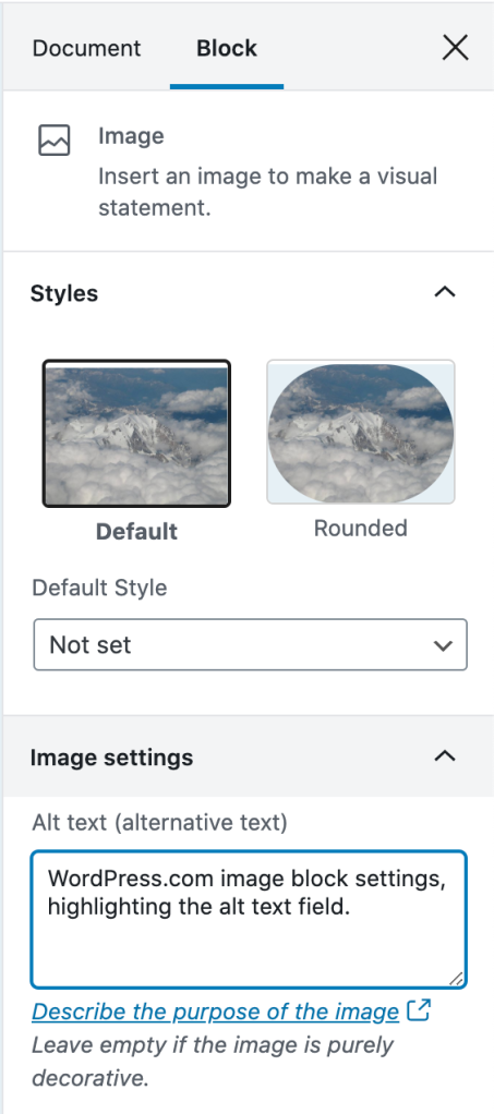
alt text is used to describe the image. It is shown when an image doesn’t load, and used in describing the image to people who are using a screen reader that reads the page content to them.

If there is no alt text on an image, the filename for the image will be read by the screen reader. Screen Shot 2020-04-30 at 4.23.44 PM.png isn’t usually helpful. What is helpful is a description of the image like, “WordPress.com image block settings, highlighting the alt text field.”
Tips for Writing alt Text
I asked for advice on Twitter about writing good alt text, and received some great advice:
- Be descriptive, but succinct (1 – 3 sentences max).
- Highlight the important details in the image that are relevant to the page content.
- The same image may be described in different ways depending on context.
- Don’t start it with “An image of” or “A gif of.”
For more help, this article from Hubspot gives examples of good and bad alt text.
Writing Links
It’s easier said than done since it’s so engrained in how people write copy for the web, but you should always avoid generic phrases like “click here” or “read more” in links.
The ideal is that you understand what the link is about solely from the link text. This is good practice in general, but extra important for users who utilize a Link Rotor or something that will show them a list of all the links on a page. Otherwise, when you open the Link Rotor you’ll see a wall of ambiguous and unhelpful “click here” and “read more” links.
Taking this article as an example, I could have written all my links as “click here.” This would result in the Link Rotor looking like this:

Instead, I describe the contents of the link so you can understand it out of context. The Link Rotor for this article contains links like:
- examples of good and bad alt text
- The Importance of HTML Headings Section
- pull quotes are not coded correctly
- ratio of at least 4.5:1
- WebAIM’s Contrast checker
Which one is clearer to you? This is a great example of something that we often don’t consider since it’s so normalized on the internet, but results in a not-so-great experience for lots of people.
Don’t Open Links in a New Tab
Every link in every browser already lets people open them in a new tab (for most people, this is right click the link, then select “Open Link in New Tab”).
Don’t make your links open in a new tab by default. It can be really confusing for screen reader users who don’t realize that clicking the link brought them into a new window. This also breaks the “back” button to go to the previous page, as the new window has a new history context.
If you absolutely have to have a link open in a new window, make sure that the link text contains (opens in a new tab) so the user knows what is going to happen.
Considering Colors
There’s a lot more to consider with color palettes than most people realize, and the issues I’ll mention are widespread on websites, large and small.
Color Contrast
Color contrast is the ratio between the background and the text color. You want a ratio of at least 4.5:1. If you’re like me and that doesn’t mean much to you, you can use WebAIM’s Contrast Checker. It will tell you if your background and text colors have sufficient contrast.
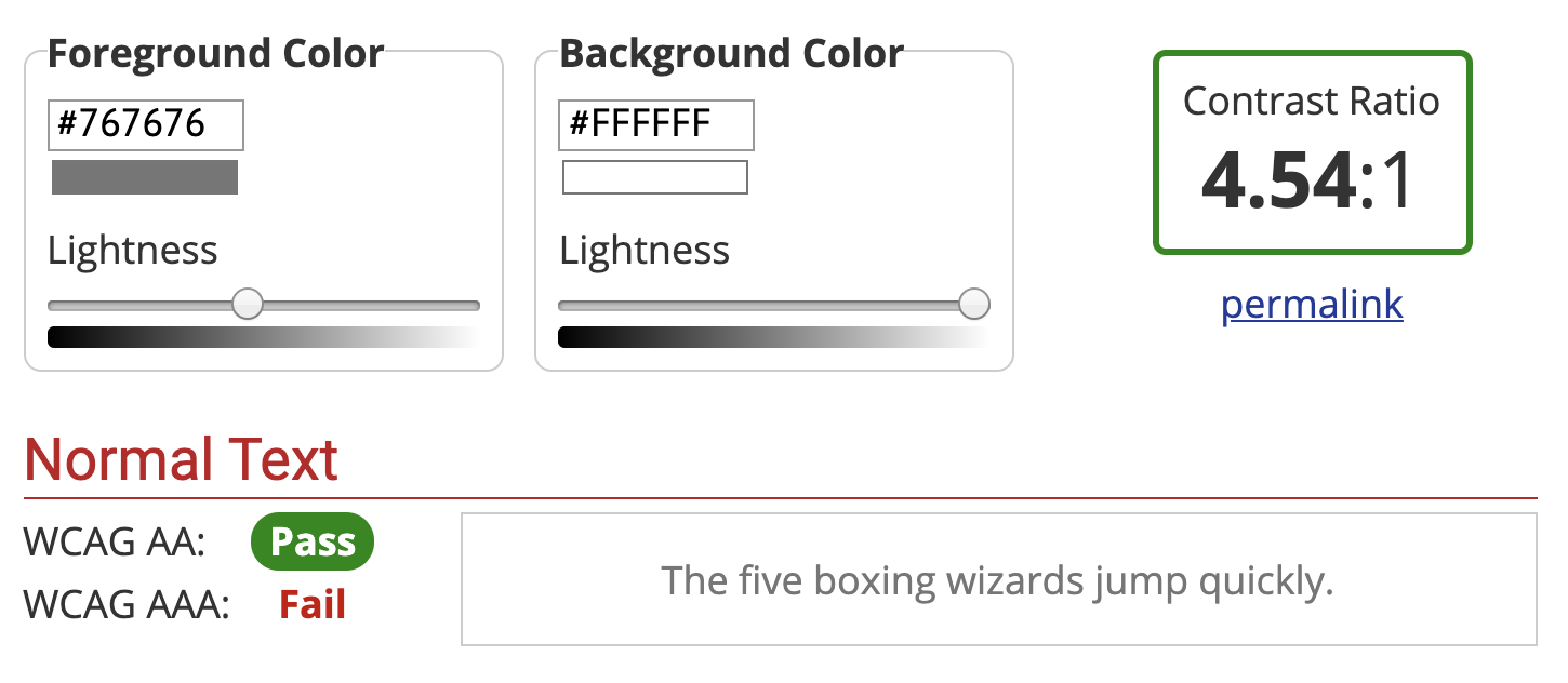
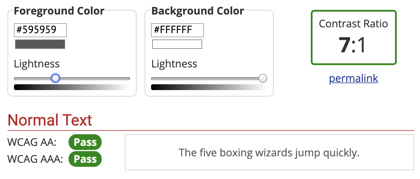
You’ll want to make sure you at least pass on the WCAG AA guidelines. The WCAG AAA is the best level of compliance, but AA is still great.
Color Blindness
There are several types of color blindness, but the most common are forms of red/green color blindness. For example, let’s check the difference between:
- a red checkmark (generally “bad/wrong”)
- a green checkmark (generally “done/correct/complete”)
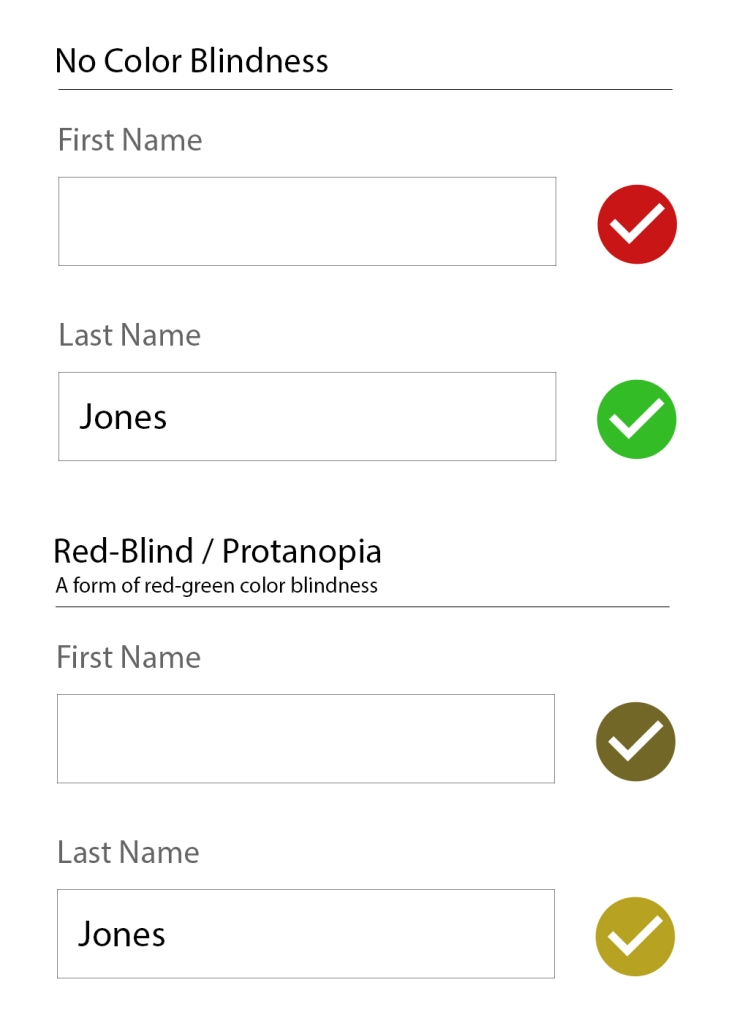
If you’re only using the colors red and green to indicate those “wrong vs correct” states, then not everyone is going to be able to understand that.
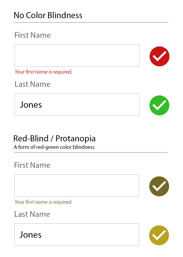
The general recommendation for ensuring accessibility is to not rely on color alone to communicate something. So, instead of just a red or green checkmark, label what the checkmark means as well.
Little Extras
Some things don’t need a full section to explain them, but are very worth mentioning:
- Label icons: Similarly to why we should not rely on color alone to communicate something, don’t rely on an icon alone to communicate something. Your icon’s meaning may be obvious to you, but it’s not obvious to everyone.
- Don’t use images of text: It’s common on twitter for people to share a portion of an article as an image so they can get past the character count limitation. This is fine for sighted users, but unless all the text from the article image is included as
alttext, it’s inaccessible. - Caption your audio and video: If you have video or audio content, make sure you provide the captions or transcript for it. Without that, it’s inaccessible to people who are deaf or hard of hearing.
- Write clearly and use images: Not everyone has a college reading level in your language. Make sure your content is as easy to understand as possible. Images and bulleted lists are your friends.
Recap
There’s a lot to consider when writing accessible content, but once it’s engrained in how you work, it becomes second nature.
- Use Headings appropriately.
- Consider how the content would be read aloud.
- Set the correct
alttext for images. - Write descriptive links (don’t use generic phrases like “click here”).
- Generally don’t use links that automatically open in a new tab.
- Have sufficient color contrast for all text.
- Don’t use color combinations that will make your site inaccessible to those with a form of color blindness.
Drop a (kind) comment below if you think I missed something big that deserves more attention.
 Jerry Jones
2 responses to “Accessibility 101 for Content Creators”
No more “click here” in links. That’s something I can stop doing immediately. Thanks!
LikeLiked by 1 person
[…] If you see light gray text on a white background (or another difficult-to-read color combination), it’s likely that the people building the site did not consider (or, worse, actively dismissed) accessibility. If it’s hard to read for you, it probably doesn’t have enough color contrast. […]
LikeLike