Category: Code

  • Extensively Extending Sass @extend: How I Overused Extends

    Right now, I believe CSS should be minimal, meaningful (to people), and not descriptive of what it looks like (visually). Also, I can be a bit of an idealist. Especially at the beginning of a project.

    As a warning, this post isn’t meant to teach basic CSS concepts. Get ready for some CSS nerdery.

    Project Overview: BEM and Utility %placeholders

    I’m using BEM (Block, Element, Modifier) syntax, and it’s amazing. I can build a solid component marked up with one or two BEM classes per element, keep my Sass mostly un-nested to avoid specificity issues, and the HTML looks clean.

    But, utility CSS classes are sooooo handy. Want it to be smaller text? We have a class for that called .small. Align it to the right? How about something elegantly named .align-right? Want it a different color? Maybe, .blue? or .green? Just add a class to your HTML and we’re done!

    Well, at some point, I’d rather write my CSS by hand in a CSS file. Not to mention, that HTML is no longer so fresh, so clean.

    How to get the best of both worlds? Lots and lots of %placeholders in my CSS. All of the %placeholders. So those utility classes become Sass %placeholders that I @extend.

    This all still sounds so fresh, so clean. Here’s where it gets uglier.

    You can’t use Sass extends inside media queries.

    Well, you can, but it gets hairy. I used Hugo Giraudel’s Cross-Media Query @extend Directives in Sass to work around the issue, and his solution is pretty clever and hard to understand. I’m not going to attempt to explain it. Using his method in place of the default %placeholder, I could use his @include _(‘foo’); inside my pre-defined breakpoints like this:

    @include placeholder('font--small') {
       font-size: 0.8rem;
    }
    
    @include placeholder('font--large') {
       font-size: 2.8rem;
    }
    
    // why I don't like visually descriptive
    // classes in HTML
    
    .big-thing {
        @include _(font-small);
    
        @include breakpoint(medium) {
            @include _(font--large);
        }
    }
    

    Extending Extends of Extends to Extend their Extensiveness

    Quick note. This is supposed to be overly contrived. The point is, I’m abusing placeholders and hoping they’ll operate like a @mixin, which they clearly don’t. Skip to Wait, What? if you’re already convinced.

    So, If I’m using @extends as utilities, why shouldn’t I @extend my extends? I mean, besides that I’m blatantly ignoring how they’re supposed to work and hoping things will turn out OK. Let me give you an example.

    @include placeholder('icon--blue-bg') {
        background: $blue;
        fill: #fff;
    }
    
    @include placeholder('icon--circle') {
        border-radius: 50%;
        @include _(icon--blue-bg);
    }
    
    @include placeholder('icon--white-bg') {
        background: #fff;
        fill: $blue;
    }
    
    @include placeholder('icon--normal') {
        width: 1.2rem;
        height: 1.2rem;
    }
    
    @include placeholder('btn--icon__icon--circle') {
        @include _(icon--circle);
        @include _(icon--white-bg);
        @include _(icon--normal);
        margin-left: 0.5em;
        position: relative;
        top: 0.15rem;
    }
    
    .btn--icon__icon--circle {
        @include _(btn--icon__icon--circle);
    }
    

    That’s %placeholders three levels deep and BEM to the max, y’all. That last class, .btn--icon__icon--circle means “a button that has an icon and this is styling the icon within that button, and the icon should be in a circle”. Whew.

    So, that all kind of makes sense? Maybe? Right?

    The issue is, that once you apply that placeholder to something and want to override it, the CSS specificity gets weird. The specificity is now applying to the location of your placeholders because of how Sass compiles @extends. So, if I wanted to make a button icon have a circle, but I actually want that circle to be a blue background?

    I’d just use my icon--blue-bg placeholder! Easy. Right?

    .btn--icon__icon--circle--blue {
        @include _(btn--icon__icon--circle);
        @include _(icon--blue-bg);
    }
    

    Nope.

    The issue is that the placeholder('icon--blue-bg') has to come after the placeholder('icon--white-bg'). _('icon--blue-bg') can never override _('icon--white-bg'). I’ve introduced specificity into order of the %placeholders. Not at all what I wanted to do.

    Wait, what?

    To review, I used these weird placeholder @includes to replace Sass’s default %placeholders so I could use @extends inside of media queries so I could keep my HTML so fresh and so clean.

    I wish I had typed that awful sentence before I did all the work to incorporate it. Maybe that would have shown me that I was over-engineering something in the pursuit of idealism.

    As my friend Jonathan Vieker says, “What would this look like if it were easy?”. Well, Jonathan, certainly not this.

    But, That’s Just Your Weird @include placeholder(‘stuff’)!

    That’s what I was hoping, too. The same specificity issue still applies with good ol’ placeholders. Check this:

    %font--large {
      font-size: 2.8rem;
    }
    
    %font--small {
      font-size: 1rem;
      @extend %font--large;
    }
    
    .extend-big {
      @extend %font--small;
      @extend %font--large;
    }
    

    Obviously this is really contrived (but not really once you’re using breakpoints). Will .extend-big be small or large? Any guess?

    It’s small. SMALL, I SAY!

    The specificity isn’t about when you apply it to the .extend-big class, it’s about the location of the @extend itself. So, want to make it large? Don’t worry about changing the order on the .extend-big class, you have to change the order of the %placeholders themselves like this:

    %font--small {
      font-size: 1rem;
      @extend %font--large;
    }
    
    %font--large {
      font-size: 2.8rem;
    }
    
    .extend-big {
      @extend %font--small;
      @extend %font--large;
    }
    

    Now .extend-big will be large.

    Here’s a codepen for you to play around with to see it in action:

    See the Pen Extensively Extending Sass Extends by Jerry Jones (@jeryj) on CodePen.

    //assets.codepen.io/assets/embed/ei.js

    How I Could Have Made it Easy

    You know what you can use inside of a media query and not worry about specificity? Yup. A @mixin. I knew that before I started. But I wanted so fresh, so clean! What I got was a headache of vague specificity.

    For my next project, my current plan is to use @mixins as utility classes, and then use CSSO with Gulp to trim down the CSS, effectively doing what my elusive ideal %placeholder would have done.

    Here’s an example using the same example above but with @mixins and CSSO.

    @mixin font--large {
      font-size: 2.8rem;
    }
    
    @mixin font--small {
      font-size: 1rem;
      @include font--large;
    }
    
    .mixin-big {
      @include font--small;
      @include font--large;
    }
    
    // just to contrive it more for good measure,
    // let's add another class
    
    .csso-mixin-big {
      @include font--large;
    }
    

    .mixin-big is actually large like you’d think it’d be. Here’s what it compiles to in Sass, before hitting CSSO:

    .mixin-big {
      font-size: 1rem;
      font-size: 2.8rem;
      font-size: 2.8rem;
    }
    
    .csso-mixin-big {
      font-size: 2.8rem;
    }
    

    Not so fresh, so clean. Let’s run it through CSSO:

    .csso-mixin-big,
    .mixin-big{
        font-size: 2.8rem;
    }
    

    So fresh, so clean! So fresh, so clean!

    Andre 3000 and Big Boi from Outkast busting sweet moves in their video for So Fresh, So Clean

    I haven’t tried this with a complex project or nested in lots of weird breakpoints, so I don’t know how well it’ll work. I haven’t stress tested it yet.

    But rest assured, when I do, I’ll write a post called “How I overused @mixins and CSSO”.
  • Using Picturefill Responsive Images with the WordPress Editor

    Folks, we’ve got an image bloat problem. But, it’s OK. We can fix it.

    When someone on an iPhone with a 320px wide screen on a 3G network arrives at your fancy-schmancy WordPress blog, they don’t need a 1020px wide image. They need an image that’s 320px wide. Each image you load that’s more than 320px wide compounds their slow load time.

    Sure, we could use techniques like lazy loading images to make the time to “first-load” of content a little more bearable, but how about we go to the root of the problem? Not sending people images that are larger than they need.

    Enter srcset and sizes!

    New specs for responsive images (not just images that squish and stretch), but providing images for your user’s screen size and resolution. If you don’t know anything about that and why letting the browser choose which image is best to serve up to your user, read Eric Portis’ amazing & fun post about srcset & sizes.

    Awesome, right?! Now let’s sit back and enjoy us some cute cat videos.

    …but, if you’re using WordPress, adding images with WordPress’s default “Add Media” button doesn’t generate future-proof code using the srcset and sizes attributes.

    *Sad trumpet* Waaaah, waaaaaaaaah.

    Polyfill Srcset & Sizes

    First, we need a polyfill to support srcset & sizes on old browsers. Fortunately, for us, Scott Jehl at Filament Group helped make Picturefill so we could start using responsible web design today.

    Install that on your site and come back to finish this up. This article will still be here.

    Don’t Write that href, Shortcode It!

    I love pure code. If I have to use a shortcode, I grumble a little, but know that it’s saving me a ton of time. But when I have to write HTML into the WordPress post, I get annoyed, because if I have to make changes to it in the future, I know it’ll be difficult. When WordPress generates images, it looks like something like this:

    
    <img class="alignleft wp-image-382" 
    src="skateboarding-dog-1020x612.jpg" 
    alt="Dog wearing sunglasses skateboarding a huge vert ramp" 
    width="1020" height="612" />


    So, even if you don’t want to use srscet and sizes on your images, what happens when you want to move over to use them in the future? That’s a lot o’ MySQL queries, my friend. Lots of search and replace and hoping you caught everything. I’d rather write a shortcode that’ll pass on the variables I need to generate responsive image code. Then, if (or when) I need to change it, I just have to update the shortcode function, not the database entries.

    So, how’s this for a shortcode?

    
    [rsp_img id="332"]


    Look good? Alright! Give it the Attachment (image) ID, and it generates this code on your site:

    
    <img class="post-img align-none size-large"
    sizes="100vw"
    srcset="/img/radical-skateboarding-dog-1020x612.jpg 1020w,
            /img/radical-skateboarding-dog-640x384.jpg 640w,
            /img/radical-skateboarding-dog-480x288.jpg 480w,
            /img/radical-skateboarding-dog-320x192.jpg 320w,
            /img/radical-skateboarding-dog-150x90.jpg 150w"
    alt="Dog wearing sunglasses skateboarding a huge vert ramp"/>


    Not the prettiest to read… but, it is to spec. That list of srcset images lets the browser pick the one that’ll fit best for your user’s screen.

    There’s a few options we can pass to it too:

    • id– the attachment ID, as mentioned earlier.
    • alignment– left, right, or center.
    • size– thumbnail, medium, or large.

    So, when you enter a shortcode into your editor with all the options, it might look something like this:

    
    [rsp_img id="332" alignment="center" size="large"]


    Here Comes the PHP – Adding Image Sizes

    First off, we need to register our image sizes so when a new image gets uploaded, all the right sized images get created. These are the sizes I use on this blog.

    
    add_image_size('rsp_img_xl', 1020);
    add_image_size('rsp_img_large', 640);
    add_image_size('rsp_img_medium', 480);
    add_image_size('rsp_img_small', 320);
    add_image_size('rsp_img_tiny', 150);


    I suggest setting “large” to be the full width of your content area on a desktop / laptop. Then, have one size that’s twice as large for retina versions of those desktops.

    Hijack the Add Media Output

    When a user adds an image to their post with the “Add Media” button, we want it to insert our rsp_img shortcode, not the img HTML. So, we need to add a filter to grab the submission and send our shortcode instead of the default HTML. Here’s how we’ll do that:

    
    function insert_rsp_img_shortcode($html, $id, $caption, $title, $align, $url, $size) {
        // build the align attribute
        $img_align = (!empty($align) ? ' align="'.$align.'"' : '');
        // build the size attribute
        $img_size = (!empty($size) ? ' size="'.$size.'"' : '');
        // generate the shortcode with id attribute
        $rsp_img_shortcode = '[rsp_img id="'.$id.'"'.$img_align.$img_size.']';
        // send the shortcode to the editor
        return $rsp_img_shortcode;
    }
    add_filter( 'image_send_to_editor', 'insert_rsp_img_shortcode', 10, 9 );


    Now the shortcode gets output to the editor when you add media to the post. Awesome! But… we still need to build the functionality…

    Run the rsp_img Shortcode

    Here’s the full functionality of the rsp_img shortcode. It’s commented like crazy to make it as easy as possible for you to follow along with what is happening. Hack away at it, or just copy / paste it into your functions.php file along with the insert_rsp_img_shortcode function and add_image_sizes code.

    
    // what should the shortcode do?
    function rsp_img_shortcode( $atts ) {
        // get our attributes from the shortcode
        extract(shortcode_atts(array(
            'align' => '',
            'id' =>'',
            'size' => '',
        ), $atts));
    
    
        // get all of our image sizes that we set above with add_image_size() earlier
        $img_retina = wp_get_attachment_image_src( $id, 'rsp_img_xl' );
        $img_lrg = wp_get_attachment_image_src( $id, 'rsp_img_large' );
        $img_med = wp_get_attachment_image_src( $id, 'rsp_img_medium' );
        $img_small = wp_get_attachment_image_src( $id, 'rsp_img_small' );
        $img_tiny = wp_get_attachment_image_src( $id, 'rsp_img_tiny' );
    
        // get the alt text
        $alt_text = get_post_meta($id , '_wp_attachment_image_alt', true);
    
        // get the image caption
        $attachment = get_post( $id );
        $caption = $attachment->post_excerpt;
    
        // if they want medium or small, we'll add some media queries to serve up the right images by the viewport
        // we don't actually need to change the srcset, just the sizes attribute because we're letting the browser pick the image size
        if($size === 'thumbnail') :
            // I'm making some generalizations here to deliver the right size image
            // Thumbnail doesn't mean 150x150 here, it means 'smaller than medium but appropriately sized to the screen'
            // So, thumbnail to me means:
            // 1/4 of viewport for desktop
            // 1/3 of viewport for tablets
            // 1/2 of viewport for mobile devices
            // full width if less than that
            $img_sizes = '(min-width: 48em) 25vw
                          (min-width: 34em) 33vw,
                          (min-width: 24em) 50vw,
                          100vw';
        elseif($size === 'medium') :
            // 1/2 of viewport for desktops and tablets, full width otherwise
            $img_sizes = '(min-width: 34em) 50vw,
                          100vw';
        else :
            // if you don't specify a size, or it's something other than 'thumbnail' or 'medium',
            // we're passing you the full viewport size img, dawg
            $img_sizes = '100vw';
        endif;
    
    
        // generate the html of the image. we're adding our classes, and, if there's no caption,
        // we're adding a post-img-no-caption class for styling
        $rsp_img_html = '<img class="post-img'.(!empty($align) ? ' align-'.$align : '').(!empty($size) ? ' size-'.$size : '').(empty($caption) ? ' post-img-no-caption' : '').'"
                            sizes="'.$img_sizes.'"
                            srcset="'.$img_retina[0].' '.$img_retina[1].'w,'.
                                    $img_lrg[0].' '.$img_lrg[1].'w,'.
                                    $img_med[0].' '.$img_med[1].'w,'.
                                    $img_small[0].' '.$img_small[1].'w,'.
                                    $img_tiny[0].' '.$img_tiny[1].'w"
                            alt="'.$alt_text.'"/>';
        if(!empty($caption)) :
            // ooo! We have a caption! We should wrap that image in a figure element so we can use
            // appropriate HTML5 syntax and put the caption in a figcaption element
            $rsp_fig = '<figure class="post-figure'.(!empty($align) ? ' align-'.$align : '').(!empty($size) ? ' size-'.$size : '').'">'
                            .$rsp_img_html
                            .'<figcaption class="post-figcaption">'
                                .$caption
                            .'</figcaption>
                        </figure>';
        else :
            // no caption. let's just output the straightup img html we made earlier
            $rsp_fig = $rsp_img_html;
        endif;
    
        // send on the html we generated to the page
        return $rsp_fig;
    }
    add_shortcode('rsp_img', 'rsp_img_shortcode');


    Style the Image & Caption

    We have our code running great, but it’s unstyled. Here’s the basic CSS to get it all wrapped up nice. Adjust to fit your style, and you’ll be good to go! I’m using Sass, but you can extract it to CSS too if you don’t have a Sass workflow. It’s marked up with comments to show you what’s happening and why.

    
    .post-figure {
        background: #f5f2f0;
        border-bottom: 4px solid #ddd;
        margin-bottom: 1.6em;
        max-width: 100%;
    
        .post-img {
            border: 1px solid #f5f2f0;
            display: block;
            margin: auto 0;
            width: 100%;
        }
    
        .post-figcaption {
            font-size: .85em;
            padding: 1.3em 1.3em 1em;
            color: #787A7E;
            margin-bottom: 0;
        }
    }
    
    
    .post-figure,
    .post-img-no-caption {
        margin-bottom: 2em;
        // we only need to apply this to the image if there's no figure
        // wrapped around it (like when there's no caption)
        width: 100%; // we're assuming a 100% width for a fallback if no size is specified, then overwriting if needed
    
        &.align-none,
        &.align-center {
            // we're treating these as the same. center it.
            display: block;
            margin-right: auto;
            margin-left: auto;
        }
    
        // floats
        &.align-right {
            float: right;
            margin-left: 2em;
        }
    
        &.align-left {
            float: left;
            margin-right: 2em;
        }
    
        // sizes
        // these all match our "sizes" attribute in our [rsp_img] shortcode
        &.size-thumbnail {
            width: 100%;
    
            @media screen and (min-width: 24em) {
                width: 50%;
            }
    
            @media screen and (min-width: 34em) {
                width: 33%;
            }
    
            @media screen and (min-width: 48em) {
                width: 25%;
            }
        }
    
        &.size-medium {
            width: 100%;
    
            @media screen and (min-width: 34em) {
                width: 50%;
            }
    
            @media screen and (min-width: 48em) {
                width: 30%;
            }
        }
    
    }


    What’s Next for Responsive Images?

    I’m not sure! That’s why I wanted to use a shortcode, to make sure I could adjust as specs change.

    Have any ideas on how to improve this? See any oversights in my set-up? Let me know on twitter or in the comments below.

  • Accessible Web Design Pull Quotes

    Accessible Web Design Pull Quotes

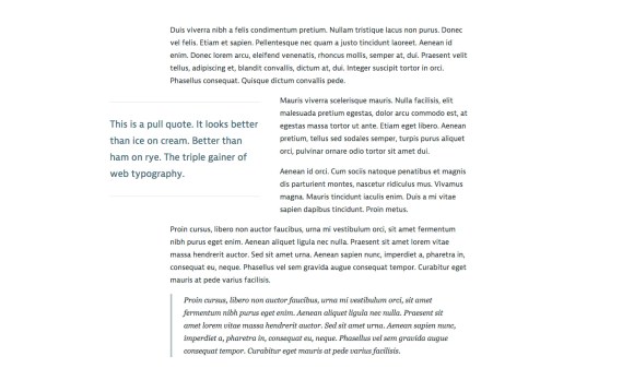
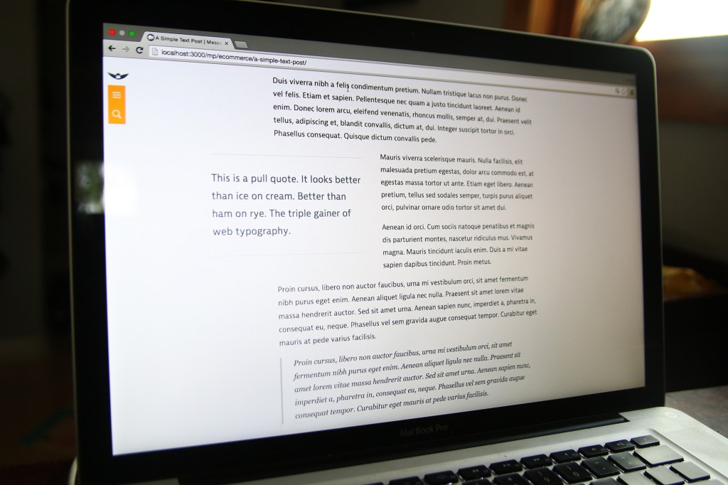
    Pull quotes are a great way for articles to pull readers in with your swanky text, reflect traditional print design, and show off your highfalutin typography skills. And, let’s be honest, it just looks so nice. If you don’t think so, you’re probably not reading this article.

    What the pull quote looks like on desktop.

    You’ll need to be OK with HTML and CSS to make this happen. Or, if you’re using WordPress, you can plop the shortcode at the end of the article in your functions.php theme file.

    HTML & Accessibility

    Pull quotes are great for print articles. You’re flipping through a magazine and it’s a way to draw you in, help you decide which articles to spend your time reading. On a website, it’s a stylistic flourish, and a way to entice your reader to actually finish the article you wrote.

    The downside with a pull quote on a website, is that you’re repeating content. What about users who have a visual disability and are using a screen reader to access your article? They’re going to have that content read to them twice, and, since there’s no cue for them that it’s just stylistic, it’ll be inserted in the article in a random place and not really make sense. Not good! Fortunately, we can fix it.

    <div class="pull-quote" role="presentation" aria-hidden="true">
        This is my awesome pull quote. It has the power to draw you in to the article, like a mystical wildebeest.
    </div>
    

    See that role=”presentation” and aria-hidden=”true” stuff? It tells screen readers to skip over that content so it’s not read to them twice. We want our pull quotes to enhance our user’s experience, not annoy them. If you want to learn more about those tags, here’s a great post about aria-hidden implementation across screen readers and browsers.

    CSS

    All the CSS I do is of the mobile-first / progressive enhancement philosophy. That means I want our base experience to be great, and for those that have additional options (like a larger screens and javascript), they get an even better experience. Here’s the CSS to draw the pull quotes out of the article and have the text wrap nicely around it.

    /* mobile-first design css */
    .pull-quote {
        border-top: 2px solid #ddd;
        border-bottom: 2px solid #ddd;
        color: #486B76;
        font-size: 1.3em;
        margin: 1em auto;
        padding: 1em 0 1em 0;
    }
    
    /* tablet styles */
    @media screen and (min-width: 34em) {
        .pull-quote {
            float: left;
            width: 50%;
            padding: 1.2em 0 1.2em 0;
            margin: .8em 2em .8em 0;
        }
    }
       
    /* desktop styles */
    @media screen and (min-width: 58em) {
        .pull-quote {
            margin-left: -20%;
        }
    }
    

    Drop that in your CSS file and tweak to your heart’s desire. I use ems for everything to keep spacings all balanced with the typography and user’s browser zoom. It’s awesome.

    There you go! Your style and HTML is there. Pretty easy. Oh, but you want to use a shortcode with WordPress instead? I do too, because marking up HTML in a WordPress post is annoying.

    Bonus WordPress Shortcode

    If you have the CSS set-up already, drop this into the functions.php of your theme file. Don’t do this on a live site or via WordPress’s internal theme editor. Well, you can, but be warned that you might break your entire site.

    function pull_quote_shortcode( $atts ) {
        extract(shortcode_atts(array(
            'quote' => '',
        ), $atts));
        return ''.$quote.'';
    }
    add_shortcode('pull_quote', 'pull_quote_shortcode');
    
    // usage 
    // [pull_quote quote="Hey, Look! A pull quote!"]
    

    That’s it! Well… you might have to adjust your site layout. Single column articles without any sidebars work best (like on this site). After you do that, put a pull quote up on your site, lean back in your chair, and think, “Oh, yeah. That pull quote looks better than an expertly executed triple gainer.”

    Just kidding, nothing is better than that.

  • This Site is Responsive

    There are still a few bugs to iron out and it’s only been tested for iPad and Chrome, but this site is now fully responsive for all screen sizes. If you’re on a desktop, go ahead and resize that browser window and watch the magic happen.

  • Set-up postfix to send emails through gMail

    A few projects I’m working on need to be able to send emails through the website, and since I develop everything locally, I need to be able to send emails from localhost.

    My searching on how to do this (remember, I’m a front-end developer!) lead me to this amazing postfix email set-up tutorial.  Enjoy!

  • Craigslist Nearby Cities Search Aggregator – Google Spreadsheet

    I made a spreadsheet in google that will take a search term and search it in all the nearby cities on craigslist and dynamically output all the results in the spreadsheet using importXML queries. You have to specify which three-letter category you want to search for. Like furniture (fua), cars by owner (cto), musical instruments (msg), etc. I’ve only tested it in some of the for sale categories.

    Here’s what you do:

    1. View the craigslist nearby cities search aggregator spreadsheet
    2. Make a copy of the spreadsheet (you have to be logged into your google account to do this (file > make a copy…))
    3. Open your spreadsheet copy in your google docs
    4. Edit the config options (the ones in light blue)
    5. View the listings on the “listings” sheet (results scroll horizontally)

    Spread the word by linking back to this page. Enjoy!

  • jQuery to Display Dynamic Content Continuously After Page Load

    The title is a mouthful, but it’s true.  A client needed a timer from a WordPress plug-in to be displayed multiple times on a page, but the plug-in didn’t allow for multiple instances on the page.  I tried to do a few workarounds by hacking (or just trying to make it do things it wasn’t intended to do without actually changing its code) the functionality of the plug-in itself to no avail.  So I turned to what is increasingly solving my web dilemmas: jQuery.

    The code to dynamically get content from the page and output it wherever you want

    $(function() {
    //Tells the code to run the code every 800 milliseconds.
    	setInterval(function() {
    
    //Tells where to place the content you're grabbing.  I'm putting
    //each one in a div with the class "countdown-timer"
    	$('div.countdown-timer').html(function() {
    
    //Sets a variable called timeRemaining, which is equal to the html
    //of the first paragraph.  So any content inside of the first 
    //paragraph gets plugged into the div class "countdown-timer"
    		  var timeRemaining = $('p:first').html();
    
    //tells the variable timeRemaining to actually output
    		  return timeRemaining;
    		});
    	}, 800);
    });
    

    To get this to work for you:

    • Change ‘div.countdown-timer’ to wherever you want the content to output. I used a class element so I could output it lots of times on the page.
    • Change ‘p:first’ to wherever you want to be grabbing the content from. Mine just happened to be the first paragraph, so it was the easiest way for me to select it.
    • Add whatever you put for the ‘div.countdown-timer’ to your page. So, for me, I put

      wherever I want the content from ‘p:first’ to appear.

    Cheers!

  • CSS3 PIE

    Oh man. My life just got a little easier thanks to the folks over at CSS3 PIE.

    Now I don’t have to make three images, line them up with empty div>s and work out odd padding/width math just to get a rounded border and a drop shadow in IE 6-8. Thanks CSS3 PIE.

  • Linking Entire List Element

    I needed a solution for making an entire list element click-able, not just the anchor text.  At the site I made for the Kirksville Brewfest, the entire background color of the list element on the enter page/style changed color, making the user think they could click on it, but only the text was click-able.  The solution I used was to take the anchor text and make its background fill the entire space.  Kirksville brewfest list code:

    ul.styles li a:link,
    ul.styles li a:visited {
    color: #....;
    display: block;
    width: 100%;
    height: 100%;
    }


    Basically, the anchor text fills up the entire li element when there’s an anchor in the ul class “styles”.

    Rad.

  • How to Detect If There’s a Featured Image on a WordPress Page or Post

    I’m redesigning the website for a Mindfulness Practice Center in New Hampshire, Morning Sun Community, and ran into an issue where I didn’t want the Title on the WordPress page to show if there was a featured image. The layout looks cleaner without the title there (although they opted to have the title appear anyways). The php code I used checks for a header image, then if there is one, do nothing. If there isn’t one, throw the title of the post in there.

    <?php
    	//Check if there is a header image
    	if ( has_post_thumbnail( $post->ID ) ) { ?>
    	<?php } else { ?>
    		<h1 class="entry-title"><?php the_title(); ?></h1>
    	<?php } ?>

    The code snippet is pretty useful anytime you want to check for a featured image and do something if there is/isn’t one.

    Have fun!