Tag: Beginner

  • The 5 Minute Accessibility Audit

    The 5 Minute Accessibility Audit

    Being great at something takes a lot of dedication and practice. But, you can often be OK at something without too much difficulty.

    This article is to help you with the latter part. Knowing just enough to be able to make an educated guess on the accessibility of a site or component/plugin.

    Can you use the site with a keyboard?

    When using a keyboard, you need to know where you’re at on the page. A focus indicator is a visible outline to show you what element you’re interacting with.

    Solid focus ring moving around on Twitter's desktop view sidebar menu.
    Focus indicator on Twitter’s Navigation

    To test the keyboard interactions:

    1. Load a page
    2. Press the tab key.
    3. Can you see a focus indicator to let you know where you are on the page?
      • If yes, then keep on pressing tab!
      • If no, then it fails. 😥You can be pretty confident that the developers did not consider accessibility when building the site.

    Note: Sometimes you use the arrow keys to interact with things as well, like on radio buttons or settings menus.

    If you can see the focus when tabbing and then you can’t access something, try the arrow keys to see if the focus moves where you want to go.

    Being able to use a keyboard for everything on the site is the biggest, quick indicator that the site has been built with accessibility in mind.

    Skip to Content Links

    When you navigate with a keyboard, you may see a “Skip to Content” link pop up. This is a good thing, and when you press it, it will move your focus to the main content of the page.

    Pressing the "Skip to the content" link on this site to move focus to the top of the Accessibility 101 for Content Creators article.
    Skip to Content links are great to avoid tabbing so much before reaching the content.

    This is really helpful, as it allows you to skip all the navigation links usually found in the header of a site, and, as the name indicates, skip you to the content.

    Zoom, Zoom!

    Zooming in several levels to show the text getting better and the content reflowing to fit the space.
    Zooming in on The A11Y Project keyboard navigation article.

    When you zoom in on a page, the text should get larger and the site should reflow to fit the available space.

    On a Mac, you can zoom with ⌘ Command and +. Press ⌘ Command and 0 to reset the zoom.

    Most sites built with Responsive Web Design (RWD) in mind should allow for this. RWD is when a site is built to accommodate any screen size and still look good.

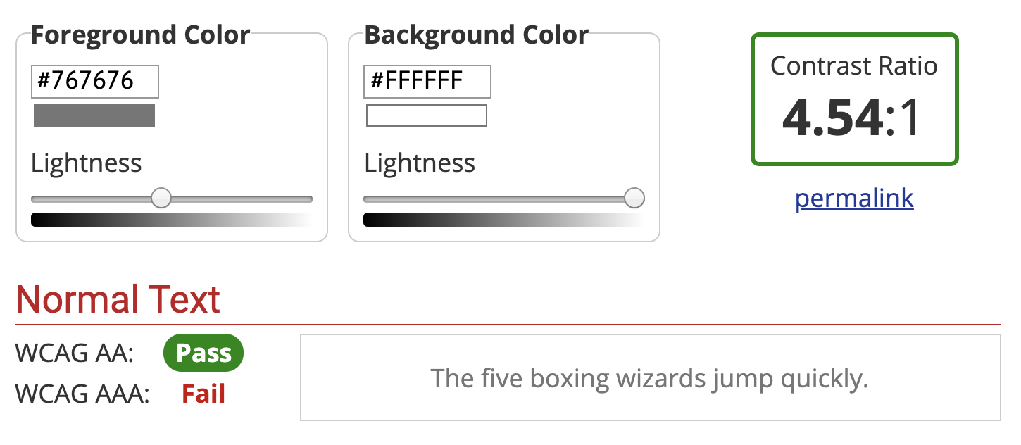
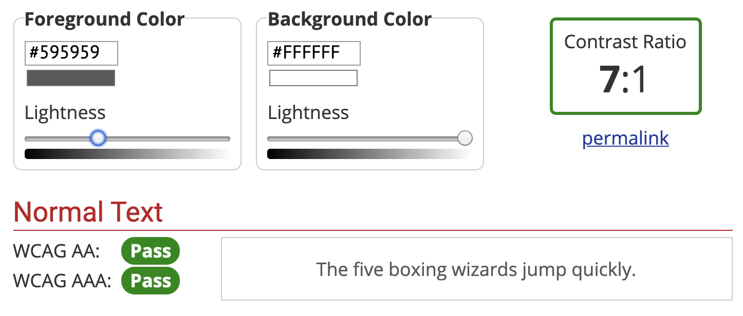
    Evaluate the Color Contrast

    If you see light gray text on a white background (or another difficult-to-read color combination), it’s likely that the people building the site did not consider (or, worse, actively dismissed) accessibility. If it’s hard to read for you, it probably doesn’t have enough color contrast.

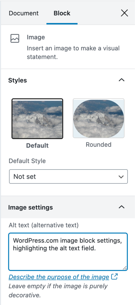
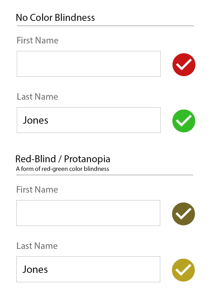
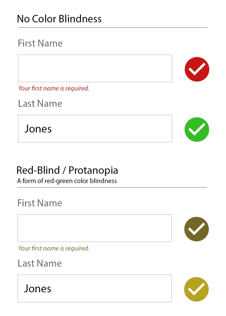
    Form Inputs Should be Labelled

    56% of the 3.4 million form inputs identified were unlabeled.

    Jared Smith, WebAIM Million – One Year Update

    A label tells you what the field is for. Take these two sign-up forms from WordPress.com and Spotify.

    WordPress.com new account form. Each input is labelled clearly: Your email address, Choose a username, Choose a password.
    Each field/input is labelled clearly.
    Sign-up form using light gray placeholder text for each input. There are no visible labels.
    Spotify’s new account form does not have visible labels. A placeholder is not a label, since it disappears after you start typing.

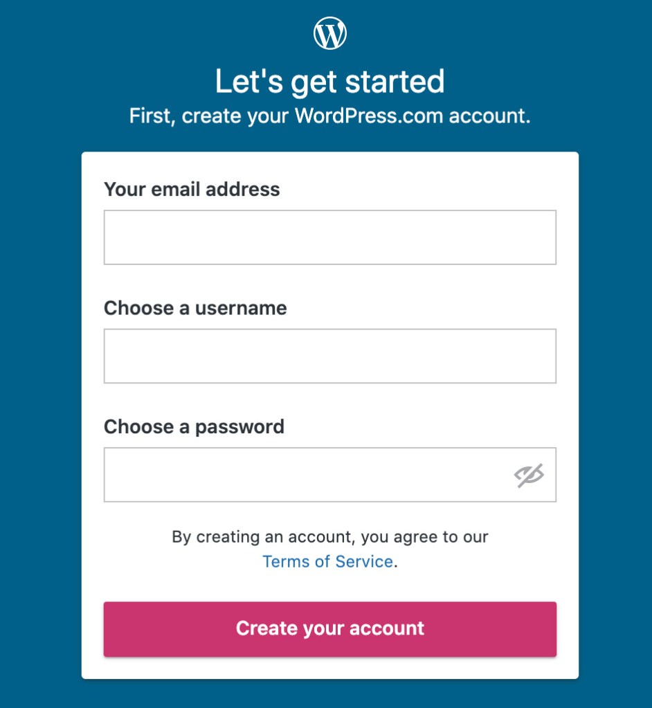
    The WordPress.com one is great. Each field is labelled clearly.

    The Spotify one seems like it’s labelled. You can see the “Email,” “Confirm email,” etc, but those are actually placeholders. A placeholder isn’t a label for two reasons:

    1. It disappears after you start typing. You might not remember what you were supposed to put there.
    2. A placeholder is supposed to show you an example of what you should put in the field. So, for an email field, an appropriate placeholder would be “example@gmail.com,” not “Email.”
    Spotify sign-up form with one of the fields focused with the text "What was this field for again?" There is no label on the input, so there's no way to know.
    Do you remember what that field was for? If it had a label, you wouldn’t have needed to remember. 🙂

    A label being visible doesn’t mean it’s fully accessible, but there’s a good chance it is. If you want to dive a little deeper, you can learn how to label an input in HTML.

    For this quick accessibility audit, check if all fields have a visible label. If they are, awesome. 🙌

    Note: One common exception to this is search fields.

    A field does not need to have a visible label if the context makes it obvious that it’s a search (like having a big button called “search” next to it).

    5 Minute Accessibility Audit Checklist

    • Can you navigate/use it with a keyboard? The focus indicator should always be visible. A Skip to Content link is a bonus.
    • Does the zoom work? Zooming in on the site should increase the size of the text, and the site should still work correctly.
    • Does the text have sufficient color contrast? Everything should be easy to read.
    • Do all form inputs have labels? Not placeholders, but labels. The label should be visible even after entering text. A search field is an exception.

    Doing this audit has served me well when I need to quickly evaluate a site, theme or plugin for baseline accessibility. It’s not perfect, but it allows you to make an educated guess on if accessibility was considered or not.

  • Learning via Terrible Ideas: Replacing Text on Click, Part 2

    Learning via Terrible Ideas: Replacing Text on Click, Part 2

    In Part 1 of Learning via Terrible Ideas, we learned how to:

    • Open the Console
    • Set a variable
    • Add a Click Listener

    But adding a click listener doesn’t make it accessible to people who use a keyboard or different kind of assistive technology.

    To make our example accessible, we’ll need to:

    • Give a “focus indicator” to everything. A focus indicator is the little glowing outline to show you where you are on the page. Press the TAB key now, and you’ll get moved to the next “focusable element.”
    • Make everything that is clickable via a mouse be able to be “clicked” with a Spacebar or Enter keypress.

    Making Everything Focusable

    Entering code and tabbing through the elements to show the focus ring moving.

    To make this Terrible Idea™️ accessible, we’ll need to give everything an attribute of tabindex="0". This adds it to the “focus order” which makes it able to be focused.

    Note: It is common for websites to not have any focus indicators. If you TAB through a site and it doesn’t show you where the focus is, then that is Bad.™️

    To give everything a tabindex attribute, we need to:

    1. Get all of the elements on the page.
    2. Loop through each of the elements.
    3. Add the tabindex attribute to each element.

    Open your Console like we did in Part 1 (right click on the page -> Inspect -> Console tab). Now enter these lines in the console:

    // Get all of the elements on the page.
    var elements = document.querySelectorAll( 'body *' )
    
    // Give each element a tabindex of 0. 
    elements.forEach( e => e.tabIndex = 0 )
    

    Note: Lines starting with // are comments to help you out. You don’t need to type them. You can, but you don’t need to.

    Now move focus back to the page (a “click” anywhere on this post will do). Press the TAB key a few times. You should have the focus moving between elements now.

    Add a keydown Listener

    Adding code in the console, then clicking to the page and tabbing to elements. Each keypress changes the focused element's text to "Daddy eats fart popsicles."

    In Part 1, we added a click listener. This made something happen each time we clicked on the page. We can “listen” for things other than click events as well.

    To make something happen on a keypress, we add a keydown listener. As soon as a key is pressed, it will run our code.

    // Set our phrase from Part 1
    var phrase = 'Daddy eats fart popsicles'
    
    // Add the Keydown Listener.
    document.addEventListener( 'keydown', e => {
      // if our keypress is a Space or Enter key, change the phrase
      if( e.code === 'Space' || e.code === 'Enter' ) {
        e.preventDefault()
        e.target.innerHTML = phrase
      }
    })
    

    Play Around!

    Now if you press TAB you should see the focus move to the next element. You can use Shift + TAB to move focus backwards. The highlighted focus indicator will show you the element you’re on.

    Each time you press Enter or Space, your element should get its text changed to whatever the phrase equals.

    What’s Next

    Part 3 is coming up. We’ll go over two things that bring a ton of power to JavaScript: arrays and functions.

    Be sure to follow me on Twitter or sign up to my email newsletter to find out when Part 3 is finished.

  • Accessibility 101 for Content Creators

    Accessibility 101 for Content Creators

    A perfectly coded website will still break down if the content isn’t written and built accessibly. This article is intended to give a no-coding-required breakdown of how to make accessible content.

    I’ll use WordPress as a basis for examples when relevant, but the same principles apply to however you build your website.

    Use Headings

    Screenshot of the WordPress.com editor, showing the headings toolbar and headings block settings.
    Setting the Heading level in the WordPress Editor.

    Headings are the titles within your page. They go in descending order from an h1 (heading one) to h6 (heading six). An h1 is the most important, h6 the lowest heading.

    I think of headings like they’re used in a book.

    • Book Title, h1: The most important.
    • Chapter Title, h2: The second most important, gives context to where you are within the book.
    • Subsection Title, h3: A section within a chapter, and so on.

    When writing content, you can structure your website using the same idea in order to give people an overview of your page.

    Tips for Headings

    • There should be only one h1 per page. This is generally your article title. On your homepage it may be the name of your site.
    • Headings should follow a descending order and shouldn’t skip a number. Here’s what your heading structure on a page might look like:
      • h1
        • h2
          • h3
        • h2
          • h3
          • h3
            • h4
        • h2
    • You will rarely need an h5 or h6

    In The Importance of HTML Headings Section I go over in more detail why Headings are important for accessibility.

    Consider How The Content Would be Read Aloud

    When people use a screen reader, the content is read to them from top to bottom. There are some things that can get annoying, quickly.

    Using a lot of emoji within a sentence, like when people separate 👏 each 👏 word 👏 with 👏 a 👏 clap 👏 emoji. This gets announced as “separate clapping hands word clapping hands with clapping hands a clapping hands clap clapping hands emoji.” That’s hard to read, and I promise it’s hard to listen to as well.

    Pull quotes can be great to grab reader’s attention, but if the pull quotes are not coded correctly, their content gets read aloud again without any indication it’s a pull quote. Imagine if someone was reading you an article and randomly read a section of the article again. That’s what a screen reader does for pull quotes.

    Image Descriptions: alt Text

    WordPress.com image block settings, highlighting the alt text field.
    Setting alt text on an image in WordPress

    alt text is used to describe the image. It is shown when an image doesn’t load, and used in describing the image to people who are using a screen reader that reads the page content to them.

    Alt text showing when an image doesn’t load.

    If there is no alt text on an image, the filename for the image will be read by the screen reader. Screen Shot 2020-04-30 at 4.23.44 PM.png isn’t usually helpful. What is helpful is a description of the image like, “WordPress.com image block settings, highlighting the alt text field.”

    Tips for Writing alt Text

    I asked for advice on Twitter about writing good alt text, and received some great advice:

    • Be descriptive, but succinct (1 – 3 sentences max).
    • Highlight the important details in the image that are relevant to the page content.
    • The same image may be described in different ways depending on context.
    • Don’t start it with “An image of” or “A gif of.”

    For more help, this article from Hubspot gives examples of good and bad alt text.

    Writing Links

    The original tweet by @ericwbailey is about why you should “Remove ‘click here’ from your copy.”

    It’s easier said than done since it’s so engrained in how people write copy for the web, but you should always avoid generic phrases like “click here” or “read more” in links.

    The ideal is that you understand what the link is about solely from the link text. This is good practice in general, but extra important for users who utilize a Link Rotor or something that will show them a list of all the links on a page. Otherwise, when you open the Link Rotor you’ll see a wall of ambiguous and unhelpful “click here” and “read more” links.

    Taking this article as an example, I could have written all my links as “click here.” This would result in the Link Rotor looking like this:

    VoiceOver Link Rotor showing a long list of "click here" links

    Instead, I describe the contents of the link so you can understand it out of context. The Link Rotor for this article contains links like:

    • examples of good and bad alt text
    • The Importance of HTML Headings Section
    • pull quotes are not coded correctly
    • ratio of at least 4.5:1
    • WebAIM’s Contrast checker

    Which one is clearer to you? This is a great example of something that we often don’t consider since it’s so normalized on the internet, but results in a not-so-great experience for lots of people.

    Don’t Open Links in a New Tab

    Every link in every browser already lets people open them in a new tab (for most people, this is right click the link, then select “Open Link in New Tab”).

    Don’t make your links open in a new tab by default. It can be really confusing for screen reader users who don’t realize that clicking the link brought them into a new window. This also breaks the “back” button to go to the previous page, as the new window has a new history context.

    If you absolutely have to have a link open in a new window, make sure that the link text contains (opens in a new tab) so the user knows what is going to happen.

    Considering Colors

    There’s a lot more to consider with color palettes than most people realize, and the issues I’ll mention are widespread on websites, large and small.

    Color Contrast

    Color contrast is the ratio between the background and the text color. You want a ratio of at least 4.5:1. If you’re like me and that doesn’t mean much to you, you can use WebAIM’s Contrast Checker. It will tell you if your background and text colors have sufficient contrast.

    WebAIM's color contrast checker showing #767676 foreground color on #ffffff background color with a contrast ratio of 4.54:1
    Minimum pure gray on white background to meet 4.5:1 color contrast ratio: #767676
    WebAIM's color contrast checker showing #595959 foreground color on #ffffff background color with a contrast ratio of 7:1
    Minimum pure gray on white background to meet 7:1 color contrast ratio: #595959

    You’ll want to make sure you at least pass on the WCAG AA guidelines. The WCAG AAA is the best level of compliance, but AA is still great.

    Color Blindness

    There are several types of color blindness, but the most common are forms of red/green color blindness. For example, let’s check the difference between:

    • a red checkmark (generally “bad/wrong”)
    • a green checkmark (generally “done/correct/complete”)
    A no color blindness example form of a First name field with a red checkmark, and a filled-in last name field with a green checkmark. The second form is identical but with a red-blind / protanopia view (a form of red-green color blindness) where the checkmarks are both a similar brownish/yellow-ish color.
    With Protanopia, the red and green checkmarks don’t help at all.

    If you’re only using the colors red and green to indicate those “wrong vs correct” states, then not everyone is going to be able to understand that.

    The general recommendation for ensuring accessibility is to not rely on color alone to communicate something. So, instead of just a red or green checkmark, label what the checkmark means as well.

    A no color blindness example form of a First name field with a red checkmark and "Your first name is required text", and a filled-in last name field with a green checkmark. The second form is identical but with a red-blind / protanopia view (a form of red-green color blindness) where the checkmarks are both a similar brownish/yellow-ish color.
    Adding a “Your first name is required” makes it clearer that there is an error.

    Little Extras

    Some things don’t need a full section to explain them, but are very worth mentioning:

    • Label icons: Similarly to why we should not rely on color alone to communicate something, don’t rely on an icon alone to communicate something. Your icon’s meaning may be obvious to you, but it’s not obvious to everyone.
    • Don’t use images of text: It’s common on twitter for people to share a portion of an article as an image so they can get past the character count limitation. This is fine for sighted users, but unless all the text from the article image is included as alt text, it’s inaccessible.
    • Caption your audio and video: If you have video or audio content, make sure you provide the captions or transcript for it. Without that, it’s inaccessible to people who are deaf or hard of hearing.
    • Write clearly and use images: Not everyone has a college reading level in your language. Make sure your content is as easy to understand as possible. Images and bulleted lists are your friends.

    Recap

    There’s a lot to consider when writing accessible content, but once it’s engrained in how you work, it becomes second nature.

    • Use Headings appropriately.
    • Consider how the content would be read aloud.
    • Set the correct alt text for images.
    • Write descriptive links (don’t use generic phrases like “click here”).
    • Generally don’t use links that automatically open in a new tab.
    • Have sufficient color contrast for all text.
    • Don’t use color combinations that will make your site inaccessible to those with a form of color blindness.

    Drop a (kind) comment below if you think I missed something big that deserves more attention.

  • Learning via Terrible Ideas: Replacing Text on Click, Part 1

    JavaScript is pretty fun. You don’t need to know much to start playing around with it. Let’s jump in with a Terrible Idea that You Should Never Do.™️

    Note: This article is intended for beginners (and kids!), but has plenty of extra tidbits along the way. I’ll be intentionally glossing over most topics, but give you enough info to be dangerous. Read along, and have fun. 🙂

    Daddy Eats Fart Popsicles

    I asked my son what he’d think was funny to do to my website. He immediately said, “Change that title to ‘Daddy eats fart popsicles.’” So, I opened the Console, and we changed it.

    To make it better, we added a way to change any text you clicked turn into “Daddy eats fart popsicles.” He clicked many more times than I would have liked.

    This article shows you how to recreate this in a few steps.

    Open the Console

    Gif of right clicking on the page to open a menu. Click the "Inspect" option, which opens a side panel of HTML Elements. Click the 
"Console" tab.
    Opening up the Console.

    Right click on the page to open a menu. Select the option that says “Inspect” or “Inspect Element.” This will open a window with a bunch of HTML and CSS.

    At the top of the new window, there’ll be a tab that says “Console.” Click that. Now we’re ready to have some fun with JavaScript.

    Set a Variable

    Gif of clicking into the Console and typing "var phrase = 'Daddy eats fart popsicles'", pressing enter, typing "phrase", and pressing enter again so the console prints "Daddy eats fart popsicles."
    Setting the phrase variable in the console.

    A variable is a way of remembering a value. Remember x in algebra? That’s a variable. We’re saying x means this other thing. In JavaScript there are three ways to define a variable, but we’ll just use one for now: var.

    Click into the console, then:

    • Type or copy/paste var phrase = 'Daddy eats fart popsicles'
    • Press Enter to set the value.
    • Type phrase
    • Press Enter to see it return “Daddy eats fart popsicles”

    If you get red error message after you press enter, something isn’t right. Check to make sure you typed everything exactly like in the example. A common issue is not including both single quotes ' around the text. Finding typos is approximately 75% of being a web developer.

    When we say var phrase =, we’re saying that phrase is whatever comes after the =. It could be anything. You can also change what the variable equals.

    • Because phrase is already defined, we don’t need to type var before phrase. We only need to do that the first time.
    • Type or copy/paste phrase = 'My son eats fart popsicles'
    • Press Enter to set the value.
    • Type phrase
    • Press Enter to see it return “My son eats fart popsicles”

    Clickity, Click

    A webpage is made of a bunch of “elements” that together, form the DOM (I say it like “dawm” or the name “Don” but with an “m” at the end). We’ll make it so any element you click ends up saying whatever phrase equals.

    In my son’s case, he reset it back to phrase = 'My daddy eats fart popsicles' 🙈

    To make something happen when you click, we add an “Event Listener.” An Event Listener waits around for something to happen. It’s like a racer waiting for the signal to go. In our case, the signal is a click.

    Gif of adding the event listener to the console and clicking on the page. Each element clicked gets replaced with the text "Daddy eats fart popsicles"
    Setting the Click Listener

    Go back to the console, then:

    • Type or copy/paste document.addEventListener( 'click', e => e.target.innerHTML = phrase )
    • Press Enter
    • BE CAREFUL BECAUSE YOU CAN NOW DESTROY THE PAGE (not permanently though, a reload will reset the page).

    Pro tip: Press the up arrow key in the console to bring back your last commands, even after reloading the page. After a reset, keep pressing the up arrow until your initial var phrase line shows up. And if nothing is working, reload the page and try again!

    I recommend clicking a title, or some content you don’t want to reread. Because after you click it, it isn’t coming back until you reload the page.

    Event Listener Code, Explained

    Let’s break down document.addEventListener( 'click', e => e.target.innerHTML = phrase ).

    • document: The entire page. The DOM we talked about earlier.
    • document.addEventListener: Add an event listener to the document. We’re adding it to the document, but we could add a click listener to any element of the page.
    • 'click': There are several kinds of event listeners, such as an event when something changes, or when a key is pressed. Our code is saying we want to listen for a click.
    • e => e.target.innerHTML = phrase: e means “event.” We’re getting the target of the event (the target is the element that was clicked) and changing its text to whatever phrase equals.

    Putting it All Together

    If you’re getting stuck or things aren’t working, reload the page, then copy and paste this into the console:

    var phrase = 'Daddy eats fart popsicles'
    
    document.addEventListener( 'click', e => e.target.innerHTML = phrase )
    

    A Mandatory Note on Accessibility

    Accessibility (or a11y) means letting people interact with your website however they want to.

    Maybe that means they have the ability to see and move their arms and hands around. If so, they probably use websites with their eyes to see and a mouse cursor to click on things.

    Some people like using a keyboard and pressing the TAB button and arrow keys to move around the website. Some people use a Screen Reader that will read a webpage to them.

    Either way, it doesn’t matter how a person interacts with your website. That’s for them to decide. But what you need to do is make sure people can interact with your website however they choose to.

    That’s exactly what we’ll learn how to do next time.

    Part 2 is in the Works

    Subscribe to my email list below or follow me on Twitter to find out when I release Learning via Terrible Ideas: Replacing Text on Click, Part 2.