Being great at something takes a lot of dedication and practice. But, you can often be OK at something without too much difficulty.
This article is to help you with the latter part. Knowing just enough to be able to make an educated guess on the accessibility of a site or component/plugin.
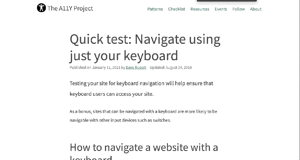
Can you use the site with a keyboard?
When using a keyboard, you need to know where you’re at on the page. A focus indicator is a visible outline to show you what element you’re interacting with.
To test the keyboard interactions:
- Load a page
- Press the
tabkey. - Can you see a focus indicator to let you know where you are on the page?
- If yes, then keep on pressing
tab! - If no, then it fails. 😥You can be pretty confident that the developers did not consider accessibility when building the site.
- If yes, then keep on pressing
Note: Sometimes you use the arrow keys to interact with things as well, like on radio buttons or settings menus.
If you can see the focus when tabbing and then you can’t access something, try the arrow keys to see if the focus moves where you want to go.
Being able to use a keyboard for everything on the site is the biggest, quick indicator that the site has been built with accessibility in mind.
Skip to Content Links
When you navigate with a keyboard, you may see a “Skip to Content” link pop up. This is a good thing, and when you press it, it will move your focus to the main content of the page.
This is really helpful, as it allows you to skip all the navigation links usually found in the header of a site, and, as the name indicates, skip you to the content.
Zoom, Zoom!
When you zoom in on a page, the text should get larger and the site should reflow to fit the available space.
On a Mac, you can zoom with ⌘ Command and +. Press ⌘ Command and 0 to reset the zoom.
Most sites built with Responsive Web Design (RWD) in mind should allow for this. RWD is when a site is built to accommodate any screen size and still look good.
Evaluate the Color Contrast
If you see light gray text on a white background (or another difficult-to-read color combination), it’s likely that the people building the site did not consider (or, worse, actively dismissed) accessibility. If it’s hard to read for you, it probably doesn’t have enough color contrast.
Form Inputs Should be Labelled
56% of the 3.4 million form inputs identified were unlabeled.
Jared Smith, WebAIM Million – One Year Update
A label tells you what the field is for. Take these two sign-up forms from WordPress.com and Spotify.
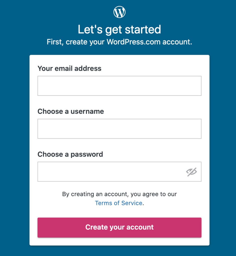

The WordPress.com one is great. Each field is labelled clearly.
The Spotify one seems like it’s labelled. You can see the “Email,” “Confirm email,” etc, but those are actually placeholders. A placeholder isn’t a label for two reasons:
- It disappears after you start typing. You might not remember what you were supposed to put there.
- A placeholder is supposed to show you an example of what you should put in the field. So, for an email field, an appropriate placeholder would be “example@gmail.com,” not “Email.”

A label being visible doesn’t mean it’s fully accessible, but there’s a good chance it is. If you want to dive a little deeper, you can learn how to label an input in HTML.
For this quick accessibility audit, check if all fields have a visible label. If they are, awesome. 🙌
Note: One common exception to this is search fields.
A field does not need to have a visible label if the context makes it obvious that it’s a search (like having a big button called “search” next to it).
5 Minute Accessibility Audit Checklist
- Can you navigate/use it with a keyboard? The focus indicator should always be visible. A Skip to Content link is a bonus.
- Does the zoom work? Zooming in on the site should increase the size of the text, and the site should still work correctly.
- Does the text have sufficient color contrast? Everything should be easy to read.
- Do all form inputs have labels? Not placeholders, but labels. The label should be visible even after entering text. A search field is an exception.
Doing this audit has served me well when I need to quickly evaluate a site, theme or plugin for baseline accessibility. It’s not perfect, but it allows you to make an educated guess on if accessibility was considered or not.
 Jerry Jones
Leave a comment