On my team at Automattic, we built the new Podcast Player block released in Jetpack 8.5 and on WordPress.com. This post is intended to give you a behind-the-scenes style look at all the little details that went into attempting to provide a good, accessible experience for everyone.
I’ll be focusing a lot on Screen Reader-specific considerations, using plenty of VoiceOver gifs and images.
To get started, here’s the block in action:

Episode 30: The Magic of Meetups – Distributed, with Matt Mullenweg
- Episode 30: The Magic of Meetups
- Episode 29: Dylan Field, Figma Co-founder, Talks Design, Digital Economy, and Remote Culture with Host Connie Yang
- Episode 28: Erica Pandey of Axios on Returning to Work
- Distributed by Default: Matt Mullenweg on The Knowledge Project
- Episode 27: Leading with Values: Sid Sijbrandij joins Matt Mullenweg to talk about GitLab, Transparency and Growing a Distributed Company
I’ll break down each decision made related to accessibility:
- Titles
- Description
- Playlist Markup
- Communicating State
- Feedback on Actions
One Title or Two?
At the top of the player we have two titles:
- Track Title: 396 – This Day in Esoteric Political History
- Podcast Title: 99% Invisible
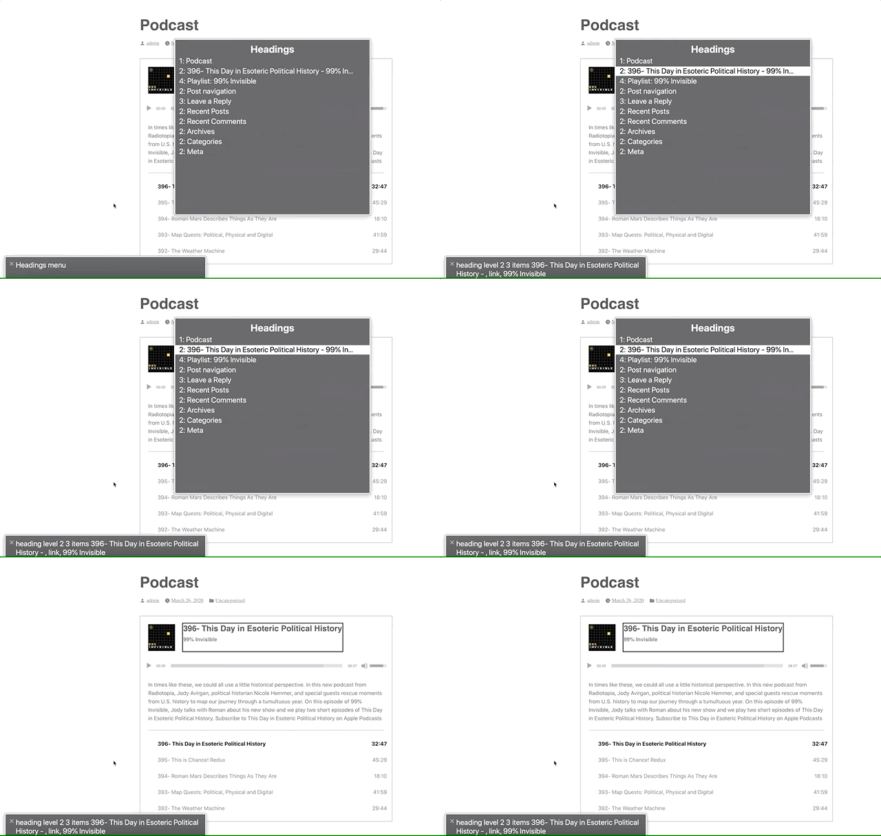
Screen readers can navigate by headings. We could mark these up as two separate titles, but one heading would be immediately followed by another. Grouping them provides a heading that accurately describes the podcast player’s state: “[track title] – [podcast title]”

Positioning the Description
Although the description is visually placed underneath the player, it’s contextually related to the heading. A screen reader will follow the DOM, so this would end up being read as:
- Player Title
- Audio controls (play, slider, etc)
- Track description
Semantically, it makes more sense for this to be arranged as:
- Player Title
- Track description
- Audio controls (play, slider, etc)
So that’s how I structured the DOM. I write the HTML as the ideal semantic flow, then use CSS to match the design.
In this case, we’re using display: flex; with an order: 99; on the description to reposition it visually after the player. This isn’t ideal, as it can be bad to rearrange the visual part of the DOM when it’s related to focus order. In this case, I think it’ll be OK since the description isn’t focusable.
Playlist Context
The playlist is an <ol> with a list of <a role="button">s. Don’t worry, we used <a> with role="button" to provide a progressively enhanced player and implemented a SPACEBAR press to activate the button.
However, a list of buttons doesn’t provide a lot of context as to what those buttons are for. To address this, we’ve added a hidden <h3>Playlist: [podcast title]</h3> and paragraph description of the playlist and attached this as an aria-labelledby and aria-describedby on the <ol>.
![Playlist with current track highlighted and "[track title], current item, button, [podcast title], group" in the screen reader area.](https://jerryjones.dev/wp-content/uploads/2020/05/podcast-player-current-item-1.gif?w=1024)
Now when you enter the playlist, you’ll be told that you’re on a button in the context of “Playlist: [podcast title], group.”
Communicating State
I had originally marked up the track list as role="menu" with role="menuitemradio" to communicate the currently selected track. After I built and tested this, it turned out this was a bad idea.™
Basically, VoiceOver assumes that the menu is close-able, so it announces some extra information like, “Press escape to close this menu,” which isn’t accurate in our case. While the role="menu" and role="menuitemradio" seemed like a good choice according to WAI-ARIA specs, it wasn’t a good choice in practice.
After using the aria-labelledby and aria-describedby on the playlist <ol> to designate the list as a group, we can use aria-current to signify which item is currently selected.
Screen readers are supposed to announce the aria-current value, so aria-current-"track" should announce “[track title], current track, button.” In VoiceOver, it announces “[track title], current item, button.” Still pretty good.
![Playlist with current track highlighted and "[track title], current item, button, [podcast title], group" in the screen reader area.](https://jerryjones.dev/wp-content/uploads/2020/05/podcast-player-current-item-1.gif?w=1024)
Playing: [Track title]
When the track is playing (not just selected), it will visually have a playing icon next to it.
![Navigating the buttons with the screen reader to see that the current track displays "Playing: [track title]"](https://jerryjones.dev/wp-content/uploads/2020/05/podcast-player-playing.gif?w=640)
These icons did not have a title before, so even though there was an additional visual cue for the current track state, this was not accessible to a screen reader.
To address this, we added a visually hidden label so it will announce, “Playing: [track title], current item, button.”
It can be argued that this label is unnecessary since if it’s playing, you should be able to hear that the track is playing. But, what if you have your speakers off? What if you muted the player? By providing this additional label, we can make sure we’re doing all we can to communicate the current state of the player.
What just happened? Providing Feedback on Actions.
Loading
![Screen reader showing "Loading: [track title] [track description]" when a new track is selected.](https://jerryjones.dev/wp-content/uploads/2020/05/podcast-player-loading.gif?w=640)
When a new track is selected, we use WordPress’s speak() function to immediately announce, “Loading: [track title] [track description].”
Before this, it would not give any kind of immediate feedback when you pressed a track button. Thus, if it took a long time for the track to load, you’d be sitting with silence not knowing if anything had happened.
Now, there’s immediate feedback that:
- The track is loading
- What track is loading
- The track description (as it’s new content on the screen and would not be read otherwise)
Note: VoiceOver users can press ctrl to silence the message if they don’t want to hear the full description.
Playback Error
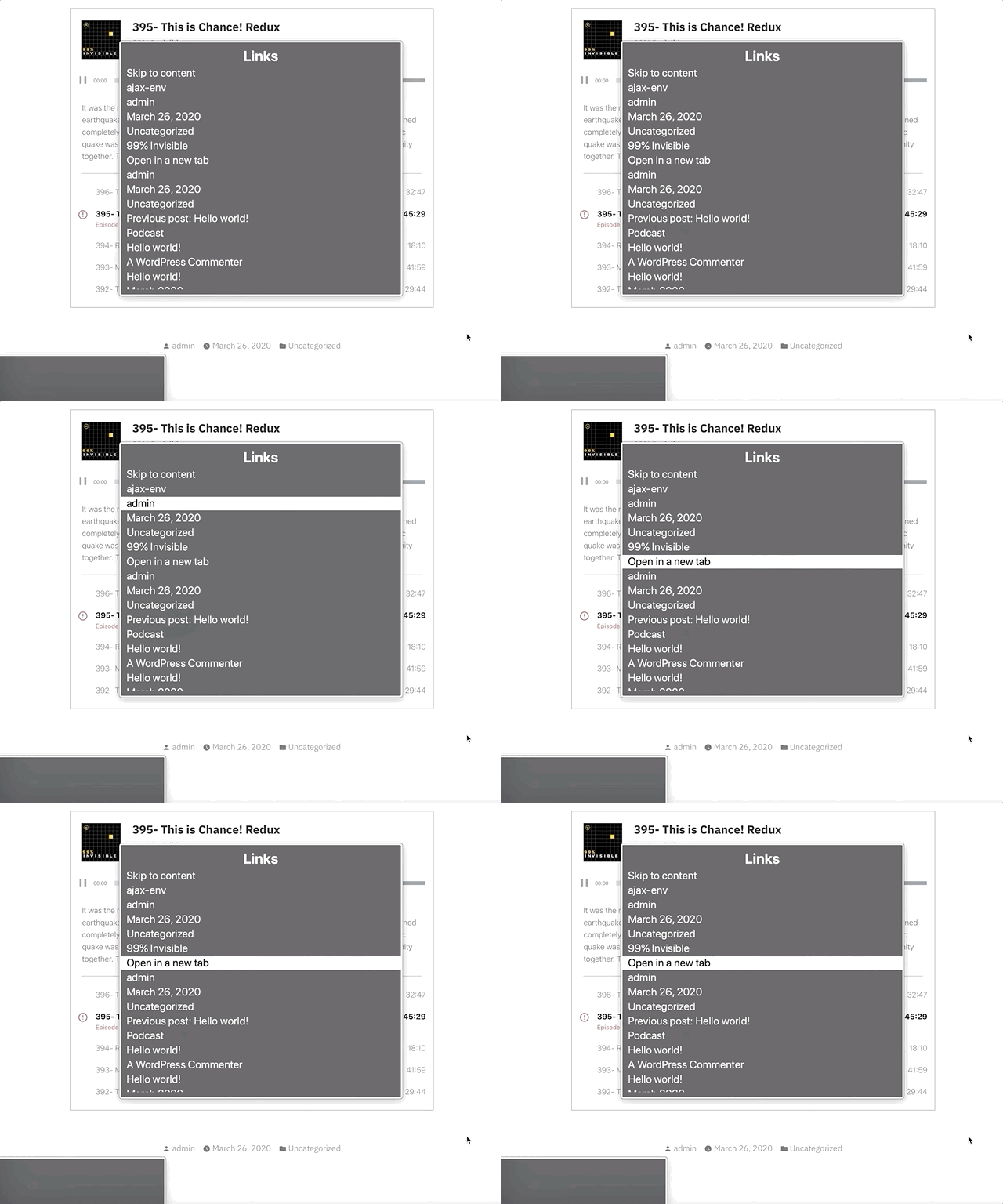
The visual error message has a link in it that says “Open in a new tab.” Screen readers can use the rotor to navigate links. When doing this, you are presented with an “Open in a new tab” link that doesn’t provide any context to what you’re opening in a new tab.

We’ve added a visually hidden podcast title in the link so it will show as “[podcast title]: Open in a new tab.” You can see this in the gif below in the bottom left gray box when the screen reader focuses the “Open in a new tab” link.

Also, when an error occurs from not being able to load the track, we use speak() to immediately announce an assertive error message to inform the user an error has occurred. Without using speak() there would have been no feedback that an error had occurred.
Paused
While this one may not be 100% needed since there’s feedback from the track no longer playing, when I tested this out I felt like it was helpful to be overt about what just happened.

This uses speak() to announce “Paused” when the currently playing track button is pressed.
Final thoughts
- Before I went down too many
ariarabbit holes, I should have tried building a few sample markups and then tested them with a screen reader. - While writing this, I kept catching myself referring to these implementations as screen reader “enhancements,” but providing a good baseline experience for the way people interact with a website shouldn’t be an “enhancement.”
- My brilliant co-worker, Haz Diego, mentioned that
role="grid"would have worked well here in order to use the rovingtabindexmethod (where you can tab to the list of tracks, but use arrow keys to navigate them) while still providing a generic grouped state for the playlist. I agree that this could have been a great option for this.
This implementation likely still has some issues, but I can promise that we did our best. If you have thoughts on how we could improve this, let me know in the comments or by opening an issue at the Jetpack Github repo.
Leave a comment