“If it looks like a duck, swims like a duck, and quacks like a duck, then it’s probably a duck.”
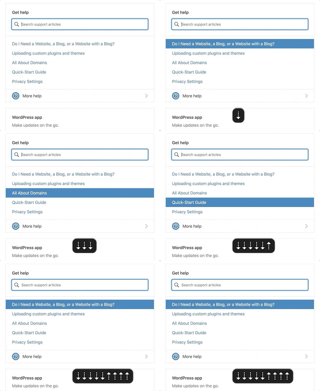
I recently worked on putting a plan together for improving the accessibility of a search component on WordPress.com. The existing interaction worked like a combobox where the focus was kept on the search input and you could navigate through the results with the down/up arrows.

If It Looks Like a Duck, Swims Like a Duck, […], It’s Probably a Duck.
I looked at this input focus with arrow keyboard navigation and thought this should be marked up as a combobox.
A combobox is a semantically linked input with a list of options within a listbox

The interaction for a combobox is very similar to the interaction of the WordPress.com search suggestion component.
- Focus remains on the input at all times
UPandDOWNarrows navigate between itemsENTERselects the item
As I considered it more, there were a couple differences in the behaviors:
- A
comboboxshould fill out the input with that text. So, selecting “Durian” from the options should fill out the input with “Durian.” In contrast, the WordPress.com search item selection would open a modal or go to a new page. - A
listboxcannot contain interactive items. The WordPress.com search items were interactive<a>or<button>elements to open a modal or bring you to a new page.
In essence, it looked like a duck and it swam like duck, so I initially jumped to calling it duck. But, it didn’t quack like a duck. I incorrectly relied on a visual model to impact how I labelled it, instead of looking at its core purpose.
HTML Markup Should Not Rely On The Visual Representation Alone
I know this. I’ve written about it. But I initially didn’t take the extra time to take a step back and really consider what the core purpose of this component was and how it should be communicated via HTML. This was me, with as many good intentions as possible, being influenced by my own ableist, sighted-centric lens.
If I had implemented a combobox to improve the accessibility, I would have felt good since I had done so much work, while simultaneously not making a difference (or potentially making it worse) for assistive technology users.
Note
I would have caught that it was a bad implementation for ATs, as I do test regularly with VoiceOver and/or NVDA while working. But I may not have caught it until after getting it to a working state and then needed to backtrack.
This Duck is a Search with Dynamic Results
The WordPress.com search suggestions component isn’t a combobox. It’s a miniature search with a <ul> list of dynamic results. The current plan on how to fix this is to:
- Add a
role="search"with anaria-labelto the search form. This will reveal it as a landmark to ATs (Assistive Technologies). - Use
speak()to announce when there are newly loaded results, loading, and error states. - Markup the search results as a
<ul>with a heading when appropriate. - At times, there will be multiple
<ul>s to group results. These results will be wrapped in a<div aria-label="Search Results">in order to communicate the entire section as a group of results connected to the search input. - Remove the
inputDOM focus arrow key navigation. Search results will beTAB‘d to like normal links.
In the end, by considering what the component is and not how it looks, we are able to:
- Significantly simplify the code
- Reduce the weight of the JS
- Communicate the search component appropriately to ATs
- Save time over implementing a far more complicated (and not as successful)
combobox
Remember to Keep Yourself in Check
If you are an able-bodied individual, it’s important to do the work to keep your perspective in check. Don’t say, “It looks like a duck, it’s probably a duck.” Take the time to consider a component’s purpose and how it will be communicated before moving forwards.
You’ll make mistakes (I certainly do). It’s OK. Keep listening, learning, and fighting the good fight. ♥️
Major props to Diego Haz for his help working through the best markup and interactions on the search component.
Leave a comment