Blog

  • Using Picturefill Responsive Images with the WordPress Editor

    Folks, we’ve got an image bloat problem. But, it’s OK. We can fix it.

    When someone on an iPhone with a 320px wide screen on a 3G network arrives at your fancy-schmancy WordPress blog, they don’t need a 1020px wide image. They need an image that’s 320px wide. Each image you load that’s more than 320px wide compounds their slow load time.

    Sure, we could use techniques like lazy loading images to make the time to “first-load” of content a little more bearable, but how about we go to the root of the problem? Not sending people images that are larger than they need.

    Enter srcset and sizes!

    New specs for responsive images (not just images that squish and stretch), but providing images for your user’s screen size and resolution. If you don’t know anything about that and why letting the browser choose which image is best to serve up to your user, read Eric Portis’ amazing & fun post about srcset & sizes.

    Awesome, right?! Now let’s sit back and enjoy us some cute cat videos.

    …but, if you’re using WordPress, adding images with WordPress’s default “Add Media” button doesn’t generate future-proof code using the srcset and sizes attributes.

    *Sad trumpet* Waaaah, waaaaaaaaah.

    Polyfill Srcset & Sizes

    First, we need a polyfill to support srcset & sizes on old browsers. Fortunately, for us, Scott Jehl at Filament Group helped make Picturefill so we could start using responsible web design today.

    Install that on your site and come back to finish this up. This article will still be here.

    Don’t Write that href, Shortcode It!

    I love pure code. If I have to use a shortcode, I grumble a little, but know that it’s saving me a ton of time. But when I have to write HTML into the WordPress post, I get annoyed, because if I have to make changes to it in the future, I know it’ll be difficult. When WordPress generates images, it looks like something like this:

    
    <img class="alignleft wp-image-382" 
    src="skateboarding-dog-1020x612.jpg" 
    alt="Dog wearing sunglasses skateboarding a huge vert ramp" 
    width="1020" height="612" />


    So, even if you don’t want to use srscet and sizes on your images, what happens when you want to move over to use them in the future? That’s a lot o’ MySQL queries, my friend. Lots of search and replace and hoping you caught everything. I’d rather write a shortcode that’ll pass on the variables I need to generate responsive image code. Then, if (or when) I need to change it, I just have to update the shortcode function, not the database entries.

    So, how’s this for a shortcode?

    
    [rsp_img id="332"]


    Look good? Alright! Give it the Attachment (image) ID, and it generates this code on your site:

    
    <img class="post-img align-none size-large"
    sizes="100vw"
    srcset="/img/radical-skateboarding-dog-1020x612.jpg 1020w,
            /img/radical-skateboarding-dog-640x384.jpg 640w,
            /img/radical-skateboarding-dog-480x288.jpg 480w,
            /img/radical-skateboarding-dog-320x192.jpg 320w,
            /img/radical-skateboarding-dog-150x90.jpg 150w"
    alt="Dog wearing sunglasses skateboarding a huge vert ramp"/>


    Not the prettiest to read… but, it is to spec. That list of srcset images lets the browser pick the one that’ll fit best for your user’s screen.

    There’s a few options we can pass to it too:

    • id– the attachment ID, as mentioned earlier.
    • alignment– left, right, or center.
    • size– thumbnail, medium, or large.

    So, when you enter a shortcode into your editor with all the options, it might look something like this:

    
    [rsp_img id="332" alignment="center" size="large"]


    Here Comes the PHP – Adding Image Sizes

    First off, we need to register our image sizes so when a new image gets uploaded, all the right sized images get created. These are the sizes I use on this blog.

    
    add_image_size('rsp_img_xl', 1020);
    add_image_size('rsp_img_large', 640);
    add_image_size('rsp_img_medium', 480);
    add_image_size('rsp_img_small', 320);
    add_image_size('rsp_img_tiny', 150);


    I suggest setting “large” to be the full width of your content area on a desktop / laptop. Then, have one size that’s twice as large for retina versions of those desktops.

    Hijack the Add Media Output

    When a user adds an image to their post with the “Add Media” button, we want it to insert our rsp_img shortcode, not the img HTML. So, we need to add a filter to grab the submission and send our shortcode instead of the default HTML. Here’s how we’ll do that:

    
    function insert_rsp_img_shortcode($html, $id, $caption, $title, $align, $url, $size) {
        // build the align attribute
        $img_align = (!empty($align) ? ' align="'.$align.'"' : '');
        // build the size attribute
        $img_size = (!empty($size) ? ' size="'.$size.'"' : '');
        // generate the shortcode with id attribute
        $rsp_img_shortcode = '[rsp_img id="'.$id.'"'.$img_align.$img_size.']';
        // send the shortcode to the editor
        return $rsp_img_shortcode;
    }
    add_filter( 'image_send_to_editor', 'insert_rsp_img_shortcode', 10, 9 );


    Now the shortcode gets output to the editor when you add media to the post. Awesome! But… we still need to build the functionality…

    Run the rsp_img Shortcode

    Here’s the full functionality of the rsp_img shortcode. It’s commented like crazy to make it as easy as possible for you to follow along with what is happening. Hack away at it, or just copy / paste it into your functions.php file along with the insert_rsp_img_shortcode function and add_image_sizes code.

    
    // what should the shortcode do?
    function rsp_img_shortcode( $atts ) {
        // get our attributes from the shortcode
        extract(shortcode_atts(array(
            'align' => '',
            'id' =>'',
            'size' => '',
        ), $atts));
    
    
        // get all of our image sizes that we set above with add_image_size() earlier
        $img_retina = wp_get_attachment_image_src( $id, 'rsp_img_xl' );
        $img_lrg = wp_get_attachment_image_src( $id, 'rsp_img_large' );
        $img_med = wp_get_attachment_image_src( $id, 'rsp_img_medium' );
        $img_small = wp_get_attachment_image_src( $id, 'rsp_img_small' );
        $img_tiny = wp_get_attachment_image_src( $id, 'rsp_img_tiny' );
    
        // get the alt text
        $alt_text = get_post_meta($id , '_wp_attachment_image_alt', true);
    
        // get the image caption
        $attachment = get_post( $id );
        $caption = $attachment->post_excerpt;
    
        // if they want medium or small, we'll add some media queries to serve up the right images by the viewport
        // we don't actually need to change the srcset, just the sizes attribute because we're letting the browser pick the image size
        if($size === 'thumbnail') :
            // I'm making some generalizations here to deliver the right size image
            // Thumbnail doesn't mean 150x150 here, it means 'smaller than medium but appropriately sized to the screen'
            // So, thumbnail to me means:
            // 1/4 of viewport for desktop
            // 1/3 of viewport for tablets
            // 1/2 of viewport for mobile devices
            // full width if less than that
            $img_sizes = '(min-width: 48em) 25vw
                          (min-width: 34em) 33vw,
                          (min-width: 24em) 50vw,
                          100vw';
        elseif($size === 'medium') :
            // 1/2 of viewport for desktops and tablets, full width otherwise
            $img_sizes = '(min-width: 34em) 50vw,
                          100vw';
        else :
            // if you don't specify a size, or it's something other than 'thumbnail' or 'medium',
            // we're passing you the full viewport size img, dawg
            $img_sizes = '100vw';
        endif;
    
    
        // generate the html of the image. we're adding our classes, and, if there's no caption,
        // we're adding a post-img-no-caption class for styling
        $rsp_img_html = '<img class="post-img'.(!empty($align) ? ' align-'.$align : '').(!empty($size) ? ' size-'.$size : '').(empty($caption) ? ' post-img-no-caption' : '').'"
                            sizes="'.$img_sizes.'"
                            srcset="'.$img_retina[0].' '.$img_retina[1].'w,'.
                                    $img_lrg[0].' '.$img_lrg[1].'w,'.
                                    $img_med[0].' '.$img_med[1].'w,'.
                                    $img_small[0].' '.$img_small[1].'w,'.
                                    $img_tiny[0].' '.$img_tiny[1].'w"
                            alt="'.$alt_text.'"/>';
        if(!empty($caption)) :
            // ooo! We have a caption! We should wrap that image in a figure element so we can use
            // appropriate HTML5 syntax and put the caption in a figcaption element
            $rsp_fig = '<figure class="post-figure'.(!empty($align) ? ' align-'.$align : '').(!empty($size) ? ' size-'.$size : '').'">'
                            .$rsp_img_html
                            .'<figcaption class="post-figcaption">'
                                .$caption
                            .'</figcaption>
                        </figure>';
        else :
            // no caption. let's just output the straightup img html we made earlier
            $rsp_fig = $rsp_img_html;
        endif;
    
        // send on the html we generated to the page
        return $rsp_fig;
    }
    add_shortcode('rsp_img', 'rsp_img_shortcode');


    Style the Image & Caption

    We have our code running great, but it’s unstyled. Here’s the basic CSS to get it all wrapped up nice. Adjust to fit your style, and you’ll be good to go! I’m using Sass, but you can extract it to CSS too if you don’t have a Sass workflow. It’s marked up with comments to show you what’s happening and why.

    
    .post-figure {
        background: #f5f2f0;
        border-bottom: 4px solid #ddd;
        margin-bottom: 1.6em;
        max-width: 100%;
    
        .post-img {
            border: 1px solid #f5f2f0;
            display: block;
            margin: auto 0;
            width: 100%;
        }
    
        .post-figcaption {
            font-size: .85em;
            padding: 1.3em 1.3em 1em;
            color: #787A7E;
            margin-bottom: 0;
        }
    }
    
    
    .post-figure,
    .post-img-no-caption {
        margin-bottom: 2em;
        // we only need to apply this to the image if there's no figure
        // wrapped around it (like when there's no caption)
        width: 100%; // we're assuming a 100% width for a fallback if no size is specified, then overwriting if needed
    
        &.align-none,
        &.align-center {
            // we're treating these as the same. center it.
            display: block;
            margin-right: auto;
            margin-left: auto;
        }
    
        // floats
        &.align-right {
            float: right;
            margin-left: 2em;
        }
    
        &.align-left {
            float: left;
            margin-right: 2em;
        }
    
        // sizes
        // these all match our "sizes" attribute in our [rsp_img] shortcode
        &.size-thumbnail {
            width: 100%;
    
            @media screen and (min-width: 24em) {
                width: 50%;
            }
    
            @media screen and (min-width: 34em) {
                width: 33%;
            }
    
            @media screen and (min-width: 48em) {
                width: 25%;
            }
        }
    
        &.size-medium {
            width: 100%;
    
            @media screen and (min-width: 34em) {
                width: 50%;
            }
    
            @media screen and (min-width: 48em) {
                width: 30%;
            }
        }
    
    }


    What’s Next for Responsive Images?

    I’m not sure! That’s why I wanted to use a shortcode, to make sure I could adjust as specs change.

    Have any ideas on how to improve this? See any oversights in my set-up? Let me know on twitter or in the comments below.
  • Accessible Web Design Pull Quotes

    Accessible Web Design Pull Quotes

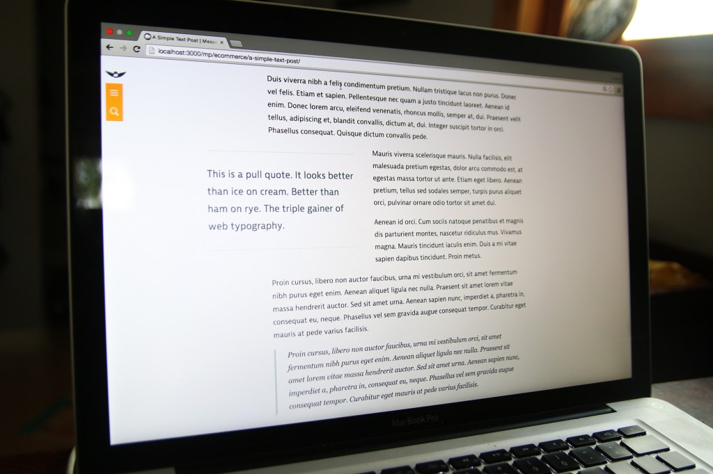
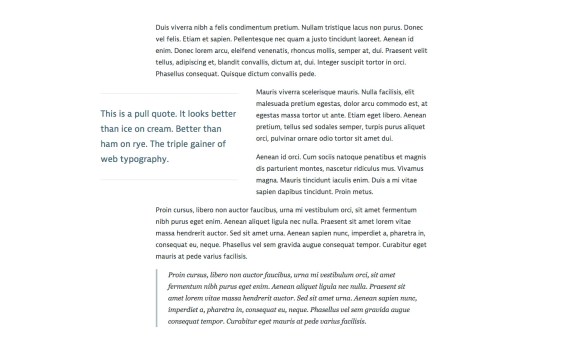
    Pull quotes are a great way for articles to pull readers in with your swanky text, reflect traditional print design, and show off your highfalutin typography skills. And, let’s be honest, it just looks so nice. If you don’t think so, you’re probably not reading this article.

    What the pull quote looks like on desktop.

    You’ll need to be OK with HTML and CSS to make this happen. Or, if you’re using WordPress, you can plop the shortcode at the end of the article in your functions.php theme file.

    HTML & Accessibility

    Pull quotes are great for print articles. You’re flipping through a magazine and it’s a way to draw you in, help you decide which articles to spend your time reading. On a website, it’s a stylistic flourish, and a way to entice your reader to actually finish the article you wrote.

    The downside with a pull quote on a website, is that you’re repeating content. What about users who have a visual disability and are using a screen reader to access your article? They’re going to have that content read to them twice, and, since there’s no cue for them that it’s just stylistic, it’ll be inserted in the article in a random place and not really make sense. Not good! Fortunately, we can fix it.

    <div class="pull-quote" role="presentation" aria-hidden="true">
        This is my awesome pull quote. It has the power to draw you in to the article, like a mystical wildebeest.
    </div>
    

    See that role=”presentation” and aria-hidden=”true” stuff? It tells screen readers to skip over that content so it’s not read to them twice. We want our pull quotes to enhance our user’s experience, not annoy them. If you want to learn more about those tags, here’s a great post about aria-hidden implementation across screen readers and browsers.

    CSS

    All the CSS I do is of the mobile-first / progressive enhancement philosophy. That means I want our base experience to be great, and for those that have additional options (like a larger screens and javascript), they get an even better experience. Here’s the CSS to draw the pull quotes out of the article and have the text wrap nicely around it.

    /* mobile-first design css */
    .pull-quote {
        border-top: 2px solid #ddd;
        border-bottom: 2px solid #ddd;
        color: #486B76;
        font-size: 1.3em;
        margin: 1em auto;
        padding: 1em 0 1em 0;
    }
    
    /* tablet styles */
    @media screen and (min-width: 34em) {
        .pull-quote {
            float: left;
            width: 50%;
            padding: 1.2em 0 1.2em 0;
            margin: .8em 2em .8em 0;
        }
    }
       
    /* desktop styles */
    @media screen and (min-width: 58em) {
        .pull-quote {
            margin-left: -20%;
        }
    }
    

    Drop that in your CSS file and tweak to your heart’s desire. I use ems for everything to keep spacings all balanced with the typography and user’s browser zoom. It’s awesome.

    There you go! Your style and HTML is there. Pretty easy. Oh, but you want to use a shortcode with WordPress instead? I do too, because marking up HTML in a WordPress post is annoying.

    Bonus WordPress Shortcode

    If you have the CSS set-up already, drop this into the functions.php of your theme file. Don’t do this on a live site or via WordPress’s internal theme editor. Well, you can, but be warned that you might break your entire site.

    function pull_quote_shortcode( $atts ) {
        extract(shortcode_atts(array(
            'quote' => '',
        ), $atts));
        return ''.$quote.'';
    }
    add_shortcode('pull_quote', 'pull_quote_shortcode');
    
    // usage 
    // [pull_quote quote="Hey, Look! A pull quote!"]
    

    That’s it! Well… you might have to adjust your site layout. Single column articles without any sidebars work best (like on this site). After you do that, put a pull quote up on your site, lean back in your chair, and think, “Oh, yeah. That pull quote looks better than an expertly executed triple gainer.”

    Just kidding, nothing is better than that.

  • Create Your Own Crowdfunding Site

    Create Your Own Crowdfunding Site

    I’ve had the honor of working with a team to design and be the front-end developer/UX designer for the best way to create your own crowdfunding site.  Users can have a fully functioning crowdfunding site up and running in two minutes, all without touching a line of code.  CrowdfundHQ was developed entirely from scratch without using any code libraries (a very rare occurrence these days), coded with Sinatra, MongoDB, CSS, Javascript, and HAML/HTML.

    CrowdfundHQ boasts a large feature list for their crowdfunding sites.  Here’s a few:

    • Unlimited Hosting
    • Customize your CSS
    • Use pre-built layouts to design your site
    • Add Pages
    • Add Categories
    • Logins using Facebook/Google
    • Extremely robust admin panel for managing campaigns and users
    • Multiple Crowdfunding Sites
    • Great price of only $79/month (one of the lowest in the industry)
    • Free 14 day trials
    • Lots more!

    Go to CrowdfundHQ to see how robust, fast, and easy it is to start your own crowdfunding site.

  • Pomona Pectin Directions

    Pomona Pectin Directions

    My largest print order to date has been completed successfully! Pomona Pectin, a fantastic small company with a internationally distributed low/no sugar pectin, wanted me to convert their current design into Adobe inDesign format for future easy updates, and add color to the layout for a print run of over 200,000 prints. The design scope was to keep it similar and familiar, but add color and draw attention and highlight certain elements to improve customer understanding of how to use the pectin, and subsequently reduce the number of calls they received on how to use the pectin.

    Here are the images, the new version first that I worked with Pomona Pectin on revising and updating, followed by the old design.

  • Takamine FP350SMC-SB

    Up for sale is my Takamine FP350SMC-SB. It’s been an incredible guitar with great tone and playability. It’s been loved and broken in over the last 9 years. I never intended to sell this guitar, but I’ve realized that I’m just better suited for a smaller bodied acoustic guitar. Contact me if you’re interested in buying it. Asking for $500-580, whatever the best offer is.

  • This Site is Responsive

    There are still a few bugs to iron out and it’s only been tested for iPad and Chrome, but this site is now fully responsive for all screen sizes. If you’re on a desktop, go ahead and resize that browser window and watch the magic happen.

  • Triangle Brain Teaser

    Triangle Brain Teaser

    UPDATE on 10/31/2012– My answer is wrong. Eagle-eye commenters found two more triangles to add to my answer, which are pointed out in the comments, and below the gallery in the UPDATE sections.


    I came across a brain teaser on Facebook that a friend had commented on, and I’m pretty much going to get obsessed with any brain teaser, so I had to give it a shot (or 3).

    It went like this.

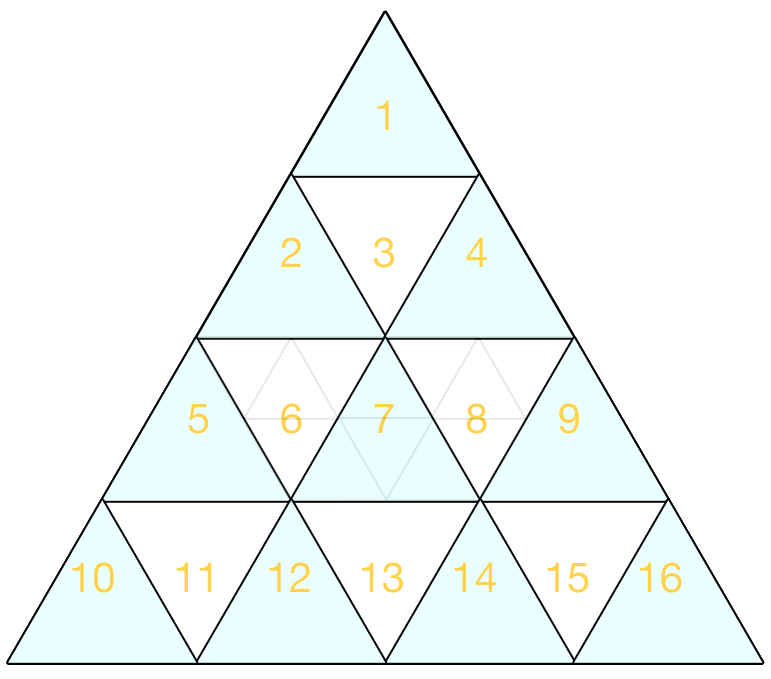
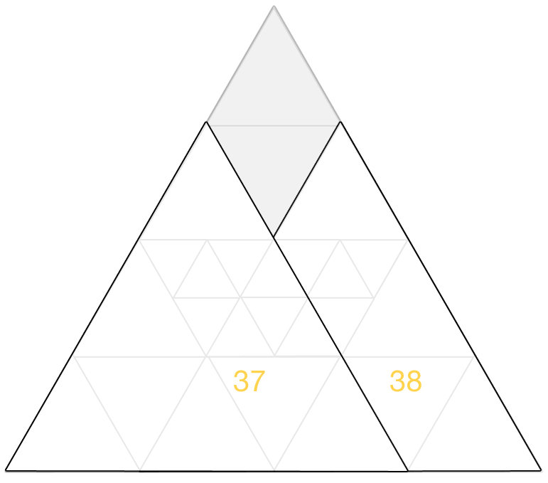
    How Many Triangles are in the Picture Below?

    I counted it at first and was sure I missed some, so I went back and tried it again and found a few more. Then, on my third try, I found what I believe is all of them. I checked a few more times and it’s all I can find.

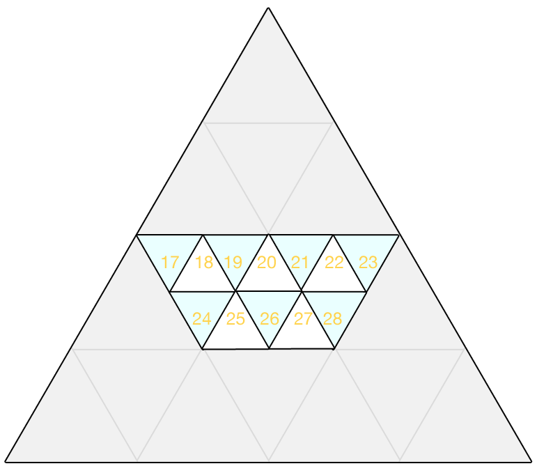
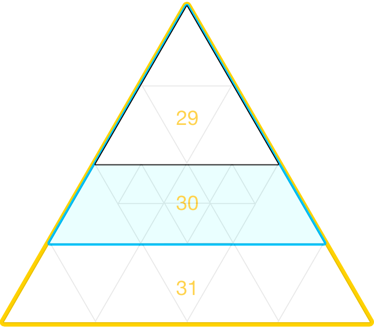
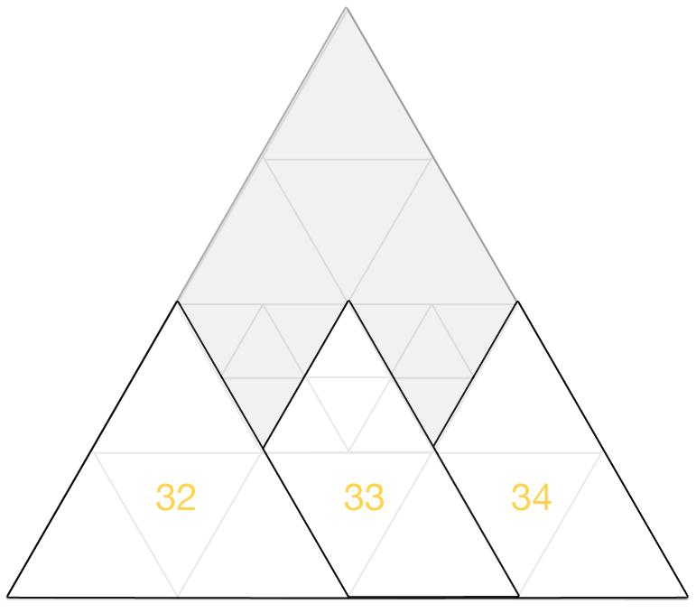
    Then, the poster of the facebook question displayed the answer to everyone as one less than what I had come up with. So, it bothered me enough that I decided to completely waste my time putting this together. The gallery shows how I found my answer.

    UPDATE on 10/10/2012– Faruk pointed out in the comments I missed one more triangle. You combine 19+20+21+26.

    UPDATE on 10/31/2012– Mr.Chinchie found another one! You combine 13+24+25+26+27+28. So the current answer is now 41 triangles. If anyone finds another, let me know!

  • WeTheTrees Going Strong

    WeTheTrees as of right now, just a little over a month into the project, has 579 users and over $18,000 in contributions.  We continue to refine the site and add/fix features as we go.  It’s becoming quite an effective, pleasant platform to use and it’s exciting to see all the amazing projects achieving their goals.

    Things like this make me glad I do what I do 🙂

  • Set-up postfix to send emails through gMail

    A few projects I’m working on need to be able to send emails through the website, and since I develop everything locally, I need to be able to send emails from localhost.

    My searching on how to do this (remember, I’m a front-end developer!) lead me to this amazing postfix email set-up tutorial.  Enjoy!