
I clearly remember the code test when going through the hiring process at Automattic. As someone with imposter syndrome and anxiety, the thought of having my code under a microscope, and confirming my fear of not being a “real” developer, isn’t exactly my idea of a fun time.
But, I made it through, and was hired as a JavaScript Engineer last year.
I recently switched over to the Hiring team, and my first task was to go through the code test again. The first time may have been stressful, but this time would be different, wouldn’t it?
After all, I’d done the test before and there was no way for me to fail now. No pressure, no stress, right?
Nope! I still felt extremely anxious doing the test.
This made me wonder: Why did I still feel so much anxiety and pressure when I could have failed miserably and still been fine?
The Psychology of Time Limited Tests
In the instructions of our code test, we recommend a 6 hour time limit:
We ask that you spend around 6 hours on this test (not counting any needed setup and/or research time) and that you complete it within one week of the test being sent to you. To be clear, please do not spend a full week of work on this. We don’t want to take up too much of your time.
Even though it’s a recommendation, as soon as I read “6 hours,” a timer started clicking in the background of my mind.
I played armchair psychologist and looked up a paper on what time-limited tests do to performance and how valid they are for evaluation. The paper talked a lot about a timed test vs an untimed power test. Our code test would be more like a power test intended to evaluate deeper skills, but we impose a non-restrictive time limit.
tl;dr: Having a time-limit, even an artificial one, is biased and not so great for people’s performance.
Time-Limited Tests Are Less Reliable
“For nearly a century, we have known that students’ pace on an untimed power test does not validly reflect their performance.”
They make it clear early on that speed does not equal skill or knowledge in an area. This has been studied with students in psychology, engineering, chemistry, finance, and more. Performance under time does not help evaluation because, “putting time limits on power tests introduces irrelevant variance“
The, “for nearly a century part,” is backed-up too. From a study done in 1914, they say:
“If we seek to evaluate the complex ‘higher’ mental functions, speed is not the primary index of efficiency, as is borne out by the evidence that speed and intelligence are not very highly correlated.”
Finally, they make their recommendation for improving reliability very clear:
“[…], we have known for decades that the best way to improve a time-limited test’s reliability is simply to remove its time limits.”
Time-Limited Tests Are Less Inclusive and Less Equitable
In the US, students with disabilities often get extended time on timed assessments. However, rarely do they actually use more than the standard time, and when they do, it’s generally only a small portion of the available extra time. In the paper, they say:
“When students request extended time or time and a half, what they are really requesting is not to feel the pressure of time ticking off; not to experience anxiety about running out of time; not to have [an untimed] power test administered as a [time-limited] test.”
Furthermore, when most people are untimed, they are fairly efficient and accurate:
“As we have known for a century: Many students, including those without disabilities, are ‘relatively inefficient in such timed … tests … [but] are able to do relatively efficient and accurate work when allowed to work more slowly.‘”
After all of this, their final recommendation shouldn’t come as a much of a surprise:
Remove all time limits from all higher educational tests intended to assess power. In addition to improving the tests’ validity, reliability, inclusivity, and equitability, removing time limits from power tests allows students to attenuate their anxiety (Faust, Ashcraft, & Fleck, 1996; Powers, 1986), increase their creativity (Acar & Runco, 2019; Cropley, 1972), read instructions more closely (Myers, 1960), check their work more carefully (Benjamin, Cavell, & Shallenberger, 1984), and learn more thoroughly from prior testing (Chuderski, 2016).
https://www.ncbi.nlm.nih.gov/pmc/articles/PMC7314377/
So, if we really want to suggest a 6 hour limit to be respectful of their time, it’s better to give a test that takes around 6 hours (or less) to be fully complete (at a high quality) and not mention a time limit. That way, it takes 6-ish hours —and we don’t introduce all the negative side-effects of having a time limit.
But we’re not really timing them
For Automattic, 6 hours is a recommendation. We want to be respectful of people’s time, which is great. We don’t do anything to actually time them, and we make it clear they can go over the time limit. A lot of the studies don’t fully apply in our situation, but it doesn’t mean the time limit doesn’t have an impact.
I had a person within my first few code test reviews mention they felt they could have done better, but went over the 6 hours. As in, they self-imposed the 6+ hour limit, even though we are not imposing it.
Their test was incomplete.
I can relate. I think one of the big reasons it affected me is that I felt like I wasn’t qualified if I couldn’t do the test within 6 hours. So I put that extra pressure on myself to prove I could. In the end, I think a lot of people disqualify themselves because they didn’t complete the test within 6 hours.
So, do the people who submit incomplete or not-so-great tests do so because they can’t do it, or because they feel like they aren’t qualified if they can’t?
Who is more likely to succeed on a time-limited test?
In the spirit of inclusion, I also wondered who is more likely to succeed on time limited tests, and if that is a hidden bias built into our code test.
The study above mentioned the benefits of removing time limits for many different people:
“[…], numerous studies show that removing time limits boosts the performance of numerous students, including students who are learning English, students from underrepresented backgrounds, and students who are older than average. Removing time limits also attenuates stereotypic gender differences.”
That’s a whopper. It’s worth reading again.
Another study had this to say about the gender bias with time limited tests:
“The effect is driven by a strong negative impact on females’ performance, while there is no statistically significant effect on males. […] Female students expect a lower grade when working under time pressure, while males do not.“
http://ftp.iza.org/dp8708.pdf
So, if you’re working in a white, male dominated field like tech, and have a time limited test in your hiring process, it shouldn’t be a surprise if you keep hiring mostly white males.
What are we doing about it?
Since we’re not really timing them, it would be better to not mention a time limit which could add further pressure..
So, that’s what we’re going to do.
We’re drafting up new instructions that remove the time limit. We’re also giving out an anonymous survey to evaluate how much pressure candidates feel during the hiring process. We don’t expect this to fix everything, but we’ll keep working towards making it better.
Everyone is different, and applying for jobs is clearly a high-stress environment, but the more we can do to put people at ease, the more accurate and inclusive our process will be.


![Playlist with current track highlighted and "[track title], current item, button, [podcast title], group" in the screen reader area.](https://jerryjones.dev/wp-content/uploads/2020/05/podcast-player-current-item-1.gif?w=1024)
![Navigating the buttons with the screen reader to see that the current track displays "Playing: [track title]"](https://jerryjones.dev/wp-content/uploads/2020/05/podcast-player-playing.gif?w=640)
![Screen reader showing "Loading: [track title] [track description]" when a new track is selected.](https://jerryjones.dev/wp-content/uploads/2020/05/podcast-player-loading.gif?w=640)


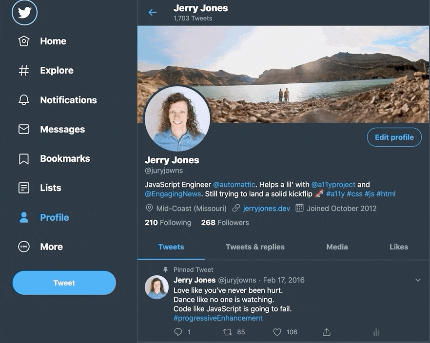


 Jerry Jones