Category: Design

  • The 5 Minute Accessibility Audit

    The 5 Minute Accessibility Audit

    Being great at something takes a lot of dedication and practice. But, you can often be OK at something without too much difficulty.

    This article is to help you with the latter part. Knowing just enough to be able to make an educated guess on the accessibility of a site or component/plugin.

    Can you use the site with a keyboard?

    When using a keyboard, you need to know where you’re at on the page. A focus indicator is a visible outline to show you what element you’re interacting with.

    Solid focus ring moving around on Twitter's desktop view sidebar menu.
    Focus indicator on Twitter’s Navigation

    To test the keyboard interactions:

    1. Load a page
    2. Press the tab key.
    3. Can you see a focus indicator to let you know where you are on the page?
      • If yes, then keep on pressing tab!
      • If no, then it fails. 😥You can be pretty confident that the developers did not consider accessibility when building the site.

    Note: Sometimes you use the arrow keys to interact with things as well, like on radio buttons or settings menus.

    If you can see the focus when tabbing and then you can’t access something, try the arrow keys to see if the focus moves where you want to go.

    Being able to use a keyboard for everything on the site is the biggest, quick indicator that the site has been built with accessibility in mind.

    Skip to Content Links

    When you navigate with a keyboard, you may see a “Skip to Content” link pop up. This is a good thing, and when you press it, it will move your focus to the main content of the page.

    Pressing the "Skip to the content" link on this site to move focus to the top of the Accessibility 101 for Content Creators article.
    Skip to Content links are great to avoid tabbing so much before reaching the content.

    This is really helpful, as it allows you to skip all the navigation links usually found in the header of a site, and, as the name indicates, skip you to the content.

    Zoom, Zoom!

    Zooming in several levels to show the text getting better and the content reflowing to fit the space.
    Zooming in on The A11Y Project keyboard navigation article.

    When you zoom in on a page, the text should get larger and the site should reflow to fit the available space.

    On a Mac, you can zoom with ⌘ Command and +. Press ⌘ Command and 0 to reset the zoom.

    Most sites built with Responsive Web Design (RWD) in mind should allow for this. RWD is when a site is built to accommodate any screen size and still look good.

    Evaluate the Color Contrast

    If you see light gray text on a white background (or another difficult-to-read color combination), it’s likely that the people building the site did not consider (or, worse, actively dismissed) accessibility. If it’s hard to read for you, it probably doesn’t have enough color contrast.

    Form Inputs Should be Labelled

    56% of the 3.4 million form inputs identified were unlabeled.

    Jared Smith, WebAIM Million – One Year Update

    A label tells you what the field is for. Take these two sign-up forms from WordPress.com and Spotify.

    WordPress.com new account form. Each input is labelled clearly: Your email address, Choose a username, Choose a password.
    Each field/input is labelled clearly.
    Sign-up form using light gray placeholder text for each input. There are no visible labels.
    Spotify’s new account form does not have visible labels. A placeholder is not a label, since it disappears after you start typing.

    The WordPress.com one is great. Each field is labelled clearly.

    The Spotify one seems like it’s labelled. You can see the “Email,” “Confirm email,” etc, but those are actually placeholders. A placeholder isn’t a label for two reasons:

    1. It disappears after you start typing. You might not remember what you were supposed to put there.
    2. A placeholder is supposed to show you an example of what you should put in the field. So, for an email field, an appropriate placeholder would be “example@gmail.com,” not “Email.”
    Spotify sign-up form with one of the fields focused with the text "What was this field for again?" There is no label on the input, so there's no way to know.
    Do you remember what that field was for? If it had a label, you wouldn’t have needed to remember. 🙂

    A label being visible doesn’t mean it’s fully accessible, but there’s a good chance it is. If you want to dive a little deeper, you can learn how to label an input in HTML.

    For this quick accessibility audit, check if all fields have a visible label. If they are, awesome. 🙌

    Note: One common exception to this is search fields.

    A field does not need to have a visible label if the context makes it obvious that it’s a search (like having a big button called “search” next to it).

    5 Minute Accessibility Audit Checklist

    • Can you navigate/use it with a keyboard? The focus indicator should always be visible. A Skip to Content link is a bonus.
    • Does the zoom work? Zooming in on the site should increase the size of the text, and the site should still work correctly.
    • Does the text have sufficient color contrast? Everything should be easy to read.
    • Do all form inputs have labels? Not placeholders, but labels. The label should be visible even after entering text. A search field is an exception.

    Doing this audit has served me well when I need to quickly evaluate a site, theme or plugin for baseline accessibility. It’s not perfect, but it allows you to make an educated guess on if accessibility was considered or not.

  • Accessibility 101 for Content Creators

    Accessibility 101 for Content Creators

    A perfectly coded website will still break down if the content isn’t written and built accessibly. This article is intended to give a no-coding-required breakdown of how to make accessible content.

    I’ll use WordPress as a basis for examples when relevant, but the same principles apply to however you build your website.

    Use Headings

    Screenshot of the WordPress.com editor, showing the headings toolbar and headings block settings.
    Setting the Heading level in the WordPress Editor.

    Headings are the titles within your page. They go in descending order from an h1 (heading one) to h6 (heading six). An h1 is the most important, h6 the lowest heading.

    I think of headings like they’re used in a book.

    • Book Title, h1: The most important.
    • Chapter Title, h2: The second most important, gives context to where you are within the book.
    • Subsection Title, h3: A section within a chapter, and so on.

    When writing content, you can structure your website using the same idea in order to give people an overview of your page.

    Tips for Headings

    • There should be only one h1 per page. This is generally your article title. On your homepage it may be the name of your site.
    • Headings should follow a descending order and shouldn’t skip a number. Here’s what your heading structure on a page might look like:
      • h1
        • h2
          • h3
        • h2
          • h3
          • h3
            • h4
        • h2
    • You will rarely need an h5 or h6

    In The Importance of HTML Headings Section I go over in more detail why Headings are important for accessibility.

    Consider How The Content Would be Read Aloud

    When people use a screen reader, the content is read to them from top to bottom. There are some things that can get annoying, quickly.

    Using a lot of emoji within a sentence, like when people separate 👏 each 👏 word 👏 with 👏 a 👏 clap 👏 emoji. This gets announced as “separate clapping hands word clapping hands with clapping hands a clapping hands clap clapping hands emoji.” That’s hard to read, and I promise it’s hard to listen to as well.

    Pull quotes can be great to grab reader’s attention, but if the pull quotes are not coded correctly, their content gets read aloud again without any indication it’s a pull quote. Imagine if someone was reading you an article and randomly read a section of the article again. That’s what a screen reader does for pull quotes.

    Image Descriptions: alt Text

    WordPress.com image block settings, highlighting the alt text field.
    Setting alt text on an image in WordPress

    alt text is used to describe the image. It is shown when an image doesn’t load, and used in describing the image to people who are using a screen reader that reads the page content to them.

    Alt text showing when an image doesn’t load.

    If there is no alt text on an image, the filename for the image will be read by the screen reader. Screen Shot 2020-04-30 at 4.23.44 PM.png isn’t usually helpful. What is helpful is a description of the image like, “WordPress.com image block settings, highlighting the alt text field.”

    Tips for Writing alt Text

    I asked for advice on Twitter about writing good alt text, and received some great advice:

    • Be descriptive, but succinct (1 – 3 sentences max).
    • Highlight the important details in the image that are relevant to the page content.
    • The same image may be described in different ways depending on context.
    • Don’t start it with “An image of” or “A gif of.”

    For more help, this article from Hubspot gives examples of good and bad alt text.

    Writing Links

    The original tweet by @ericwbailey is about why you should “Remove ‘click here’ from your copy.”

    It’s easier said than done since it’s so engrained in how people write copy for the web, but you should always avoid generic phrases like “click here” or “read more” in links.

    The ideal is that you understand what the link is about solely from the link text. This is good practice in general, but extra important for users who utilize a Link Rotor or something that will show them a list of all the links on a page. Otherwise, when you open the Link Rotor you’ll see a wall of ambiguous and unhelpful “click here” and “read more” links.

    Taking this article as an example, I could have written all my links as “click here.” This would result in the Link Rotor looking like this:

    VoiceOver Link Rotor showing a long list of "click here" links

    Instead, I describe the contents of the link so you can understand it out of context. The Link Rotor for this article contains links like:

    • examples of good and bad alt text
    • The Importance of HTML Headings Section
    • pull quotes are not coded correctly
    • ratio of at least 4.5:1
    • WebAIM’s Contrast checker

    Which one is clearer to you? This is a great example of something that we often don’t consider since it’s so normalized on the internet, but results in a not-so-great experience for lots of people.

    Don’t Open Links in a New Tab

    Every link in every browser already lets people open them in a new tab (for most people, this is right click the link, then select “Open Link in New Tab”).

    Don’t make your links open in a new tab by default. It can be really confusing for screen reader users who don’t realize that clicking the link brought them into a new window. This also breaks the “back” button to go to the previous page, as the new window has a new history context.

    If you absolutely have to have a link open in a new window, make sure that the link text contains (opens in a new tab) so the user knows what is going to happen.

    Considering Colors

    There’s a lot more to consider with color palettes than most people realize, and the issues I’ll mention are widespread on websites, large and small.

    Color Contrast

    Color contrast is the ratio between the background and the text color. You want a ratio of at least 4.5:1. If you’re like me and that doesn’t mean much to you, you can use WebAIM’s Contrast Checker. It will tell you if your background and text colors have sufficient contrast.

    WebAIM's color contrast checker showing #767676 foreground color on #ffffff background color with a contrast ratio of 4.54:1
    Minimum pure gray on white background to meet 4.5:1 color contrast ratio: #767676
    WebAIM's color contrast checker showing #595959 foreground color on #ffffff background color with a contrast ratio of 7:1
    Minimum pure gray on white background to meet 7:1 color contrast ratio: #595959

    You’ll want to make sure you at least pass on the WCAG AA guidelines. The WCAG AAA is the best level of compliance, but AA is still great.

    Color Blindness

    There are several types of color blindness, but the most common are forms of red/green color blindness. For example, let’s check the difference between:

    • a red checkmark (generally “bad/wrong”)
    • a green checkmark (generally “done/correct/complete”)
    A no color blindness example form of a First name field with a red checkmark, and a filled-in last name field with a green checkmark. The second form is identical but with a red-blind / protanopia view (a form of red-green color blindness) where the checkmarks are both a similar brownish/yellow-ish color.
    With Protanopia, the red and green checkmarks don’t help at all.

    If you’re only using the colors red and green to indicate those “wrong vs correct” states, then not everyone is going to be able to understand that.

    The general recommendation for ensuring accessibility is to not rely on color alone to communicate something. So, instead of just a red or green checkmark, label what the checkmark means as well.

    A no color blindness example form of a First name field with a red checkmark and "Your first name is required text", and a filled-in last name field with a green checkmark. The second form is identical but with a red-blind / protanopia view (a form of red-green color blindness) where the checkmarks are both a similar brownish/yellow-ish color.
    Adding a “Your first name is required” makes it clearer that there is an error.

    Little Extras

    Some things don’t need a full section to explain them, but are very worth mentioning:

    • Label icons: Similarly to why we should not rely on color alone to communicate something, don’t rely on an icon alone to communicate something. Your icon’s meaning may be obvious to you, but it’s not obvious to everyone.
    • Don’t use images of text: It’s common on twitter for people to share a portion of an article as an image so they can get past the character count limitation. This is fine for sighted users, but unless all the text from the article image is included as alt text, it’s inaccessible.
    • Caption your audio and video: If you have video or audio content, make sure you provide the captions or transcript for it. Without that, it’s inaccessible to people who are deaf or hard of hearing.
    • Write clearly and use images: Not everyone has a college reading level in your language. Make sure your content is as easy to understand as possible. Images and bulleted lists are your friends.

    Recap

    There’s a lot to consider when writing accessible content, but once it’s engrained in how you work, it becomes second nature.

    • Use Headings appropriately.
    • Consider how the content would be read aloud.
    • Set the correct alt text for images.
    • Write descriptive links (don’t use generic phrases like “click here”).
    • Generally don’t use links that automatically open in a new tab.
    • Have sufficient color contrast for all text.
    • Don’t use color combinations that will make your site inaccessible to those with a form of color blindness.

    Drop a (kind) comment below if you think I missed something big that deserves more attention.

  • A Designer’s Response to Seth Godin’s “Working with a designer (four paths)”

    In Seth Godin’s Working with a designer (four paths), he’s educating people on different things to have considered and come to terms with before approaching a designer.

    Go ahead and read his post if you haven’t before continuing here. It won’t take long.

    As a designer, I think he’s spot on about the (at least) four different kinds of clients. I’ve definitely worked with clients of the four different postures he describes. However, a big part of being a designer is teaching your client how to be a good client. You don’t learn that in school, and you’re not often in a situation of being a client on a design project.

    The first thing I do when designing for a project is to establish a goal. What are we actually trying to accomplish with the design, and why? This is incredibly helpful for people to be able to think concretely about different designs.

    For example, if a client is starting a pet grooming business and they need a logo, I’d start with a goal discussion of what they’re trying to do. After a few long discussions, we figure out that their goal is: “Provide a pampered, trustworthy and first-name basis (well, only-name basis for most animals) experience for your animal.”

    Now that the goal is established, we can base design decisions on this instead of a vague “what the client likes.” Without a goal, questions tend to be based on the look, such as “Which logo do you like better?” But, what they “like” isn’t necessarily what the best logo is for what they’re trying to accomplish.

    If you have a goal already defined, then you can ask more useful questions like:

    • “Which logo seems more trustworthy?”
    • “Which logo suggests that you’ll pamper their animal like four-legged royalty?”

    Whichever type of client you are, don’t worry about it too much. A good, experienced designer will help you clarify your goals and teach you how to be a great client.

  • Is This Thing On? A Toggle/Light Switch Quiz

    Is This Thing On? A Toggle/Light Switch Quiz

    Maybe it’s just me, but toggles and light switches always trip* me up. To pseudo-scientifically find out, I captured different toggle designs in the wild from the ol’ World Wild Web into a quiz using the Quiz Creator I designed and developed for the Center for Media Engagement.

    I’d be delighted if you took the time to answer 10 questions on what state (“on” or “off”) each toggle is communicating. Without further ado, here is the quiz, “Is this thing on?”

    Follow me on Twitter @juryjowns to hear the results.

    * Pun 100% intended.

  • The Process of Building for the Web: Quiz Creator Case Study

    The Process of Building for the Web: Quiz Creator Case Study

    Engaging News Project’s Quiz Creator is by far the biggest product I have ever designed and developed. Over an eight month period, I did all planning, design, development, architecture, testing, documentation, and deployment.

    To give you an idea of what goes into building a professional web application, I’ve documented the overarching phases of the project.
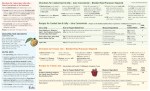
    Planning

    [rsp_img id=”2087″ align=”center” size=”full”]

    It’s essential to identify your overall project goals first. These guide every decision throughout the entire project.

    Goals should be measurable, and for the Quiz Creator, our main goal was to have ten second tier news organizations regularly using the quiz tool. As of this writing, we’ve only soft-launched the Quiz Creator, so we won’t be able to analyze if we were successful until our marketing efforts are in swing.

    After the goals were identified, I worked on:

    • User Stories to identify common user types and what their needs are.
    • Competitive Analysis to see what the current market offers and how we can improve and build upon that.
    • Documenting the Current Quiz Tool. As this was a rebuild of their existing tool, I was able to use the current implementation to identify used features and pain points, and use the database to research which features were used and which were overlooked.
    • User Flow broken down by page and component to figure out exactly what a user would need or want to view at that time.
    • New Ideas were jotted down as I went through the above stages, and fleshed out when/if they were relevant to a component.

    Planning is the foundation for the whole project, so make sure it’s sturdy before you move on.

    Sketching

    [rsp_img id=”2107″ align=”center” size=”full”]

    Sketching is one of my favorite parts of any project. I think I could use a ruler to draw straight-lined boxes all day. Maybe it’s because I was a huge hippie in my twenties with curvy lines everywhere and now I’m over-compensating.

    Really, I think I love sketching because this is where the problem solving and strategy start to come together. Sketching allows me to evaluate lots of different possibilities quickly.

    Because I’ve already planned out what elements need to be on each component, I can read my notes on what needs to be included and why. You shouldn’t be adding new elements while you sketch, you should be figuring out how to display those elements.

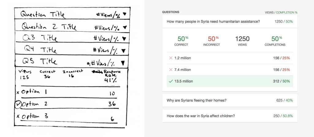
    Here’s a sketch of a component where people will view the individual question results from a quiz they created alongside an image of the completed component. The sketch is rough, but it shows the key elements that will be included and their placement. Also, note that it’s an oddity that the sketch matches the final component. Generally things change a lot more between sketch and completion.

    [rsp_img id=”2112″ align=”center” size=”full”]

    Once you’ve built and tested a lot of websites, you can visualize how someone would use the website and identify common traps. A five minute sketch can end up saving weeks of development time wasted on a bad idea.

    Testing

    Testing is an ongoing process, and it begins at sketching. I show people my sketches with a few directed questions and see if they understand what the components are how they would use them.

    Throughout the entire project, keep testing. These are generally informal at the beginning, and become more formal near the end of the project.

    For the Quiz Creator, I tested my sketches and prototypes informally, and then tested different elements of the production version as features were completed. Testing was done via Skype with willing members of the Engaging News Project team. I’d give them a task, such as “Publish a three question quiz,” and take copious notes on what they did, focusing on what was difficult for them to accomplish.

    Just as sketching can save you weeks of development, testing reveals issues you’ve missed or overlooked in your planning. The earlier you can identify these issues, the more time you’ll save. Test early, and test often.

    Prototyping

    Prototyping is used on designs that seem to pass muster, to see if they really do, indeed, pass muster. A lot can be gained by looking at a sketch on paper, but it’s another thing entirely to interact with it.

    I go as fast as I can on prototypes, not worrying about making things responsive or production-ready. There’s no database to interact with, and most elements are dropped in to get the idea across, not to be perfect.

    Here’s a series of my initial sketch for the add question view and how it changed from sketch through prototypes to final product.

    [rsp_img id=”2137″ align=”none” size=”full”]

    [rsp_img id=”2120″ align=”none” size=”full”]

    [rsp_img id=”2115″ align=”none” size=”full”]

    [rsp_img id=”2117″ align=”none” size=”full”]

    The one thing to spend more time on fine-tuning is what you think your client will be focused on. I knew the people reviewing the project were likely to get hung up on incomplete visual styles, so I polished up the typography and base styles. They were not perfect, but they were good enough to not be a distraction to people reviewing the prototype.

    Prototyping saved me a huge amount of overhead because I didn’t spend time implementing a complex system that would end up not working. When I built the production version, I was confident in the application, and usability testing confirmed that creating quizzes was an easy process.

    Architecture

    I’m mainly a designer and front-end developer, so this project was my first complex database build. If someone had told me that you get draw a bunch of straight lines when designing databases, I probably would have done this years ago.

    [rsp_img id=”2104″ align=”none” size=”full”]

    The rule of thumb for designing a database is to get it 90% complete before you start coding. You won’t get 100% coverage because you can’t foresee every possible scenario you’ll need, but if you’re 90% there, you have a strong foundation that will probably be able to accommodate anything you throw at it.

    At the same time as designing the database structure, I was working on how best to architect the methods that the Quiz Creator would interact with its own database as well as the site’s WordPress database. It was a project requirement for the Quiz Creator to be built on WordPress, but I wanted to make sure that:

    1. the plugin could be extracted in the future for other platforms without having to completely rebuild it,
    2. the database could live entirely outside of the WordPress database for speed and managing heavier loads,
    3. and, most importantly, quizzes could be embedded independently without firing up WordPress core.

    This was one of three ideas I sketched out on how the code should interact with the database to be robust, independent, maintainable, and extensible.

    [rsp_img id=”2109″ align=”none” size=”full”]

    Build

    Now that everything was in place and most of the big ideas had been figured out, I started coding the production version of the Quiz Creator. This was by far the longest part of the project, but things came together smoothly because of the extensive planning. Without planning, the coding would have gone as well as trying to build a house without a blueprint.

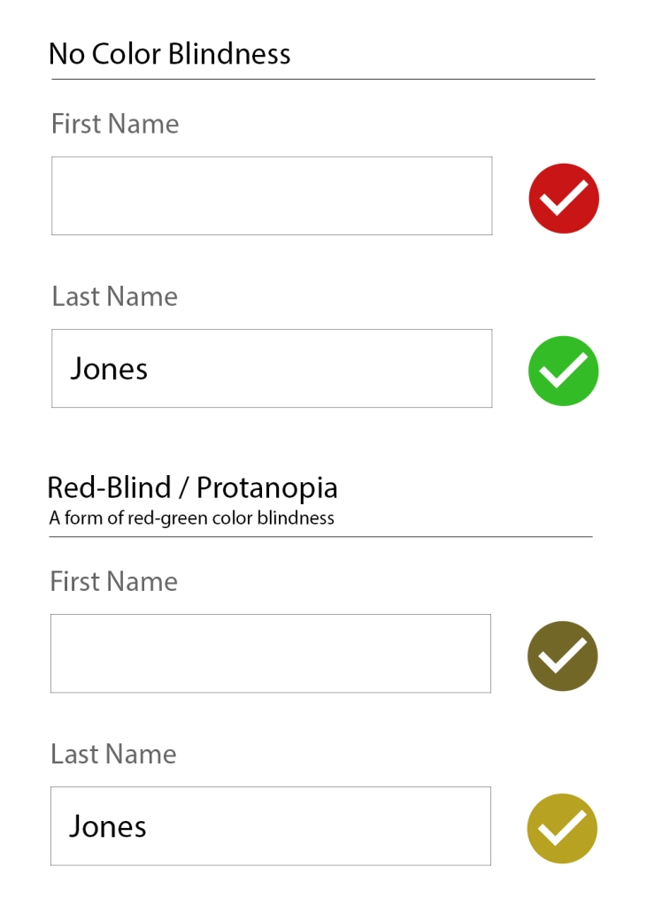
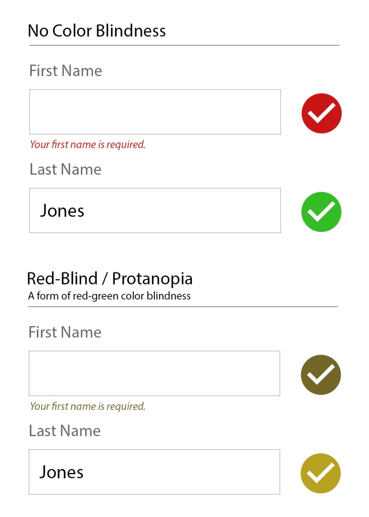
    I utilized ideas from progressive enhancement, responsive design, and web accessibility to make sure people had a great base experience on any device with any connection. The embeddable quizzes I went one step further on, and made sure you could take quizzes without cookies or localStorage. Everything is keyboard operable and screen reader friendly, and JavaScript is an enhancement, not a dependency.

    For tooling and coding (and to make sure I get to list all the hippest acronyms), I used:

    • Semantic HTML with ARIA Attributes where necessary
    • SCSS with classes using the BEM naming convention
    • JS
    • Gulp with BrowserSync, libsass, and some nice concatenators and minifiers for good measure
    • Git & Github
    • Terminal
    • Atom Editor
    • Object Oriented PHP

    There are many ways to build a site, but as long as it works quickly on any device and plays well with assistive technology, I’ll be happy with its codebase.

    Performance

    Performance is a consideration throughout the entire project (even when sketching!), but at the end is when analyzing performance across the wire makes the most sense. The lowest hanging fruit is minification and combining files. I focused on the embeddable quizzes the most, as I didn’t want people embedding bloated quizzes onto their sites.

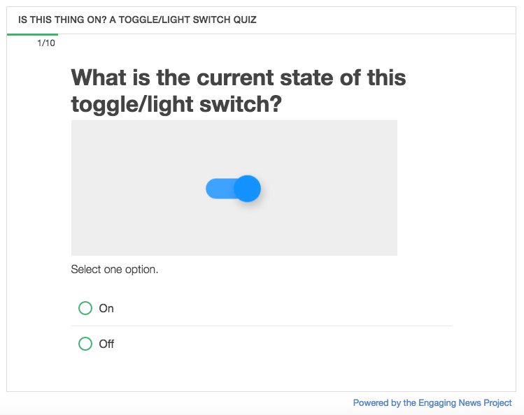
    In the end, the final embedded quizzes only load 7 files for a total of 75kb. Here’s a quiz built using the Quiz Creator where two of the answers are in the previous sentence.

    Also, make sure you’re caching your resources and that everything is gzipped.

    Analyze and Refine

    Because this project just launched, I don’t have any data to analyze yet. Once I do, I’ll be using Google Analytics to look for:

    • What percentage of people arrive at the marketing page and end up registering for an account?
    • What percentage of those people complete the process and embed a quiz?
    • If they don’t embed a quiz, where do they fall off in the process?
    • What percentage of people create and embed multiple quizzes?

    Once I have those numbers, I can use the Quiz Creator database to anonymously look at how people are using the Quiz Creator, and hypothesize what things may contribute to people becoming long term users vs people who don’t end up embedding a quiz at all.

    A few possibilities might be:

    • Maybe if someone embeds a quiz that gets at least 1000 responses, they’ll be more likely to create another quiz.
    • Maybe people publish a quiz, but need more help with the embed process.
    • Maybe the benefits of using a quiz isn’t clear enough on the marketing page.

    Using the data collected, I can save time by making better guesses. Then, I can test new ideas to improve conversion rates against the current version via AB Testing or Multivariate Testing.

    Applicability to Other Projects

    The Quiz Creator was a huge project, but you can use these same concepts for anything you build on the web, big or small. It could be an entire rebuild, or as focused as trying to improve conversion rates on a sign-up form.

    Here’s a quick recap of the process.

    1. Plan: Identify a measurable goal you want to accomplish.
    2. Sketch: Problem solve ideas on how to accomplish your goals using pen and paper.
    3. Test: From here on out, test everything, and test often.
    4. Prototype: Use the medium you’re building for, and quickly prototype examples of your sketches to see what works and what doesn’t.
    5. Architect: Before you start coding, make high-level decisions on how pieces of the application will interact with each other.
    6. Build: Make it happen.
    7. Refactor: Improve performance by minification, reducing the number of files loaded, caching, and more.
    8. Analyze and Refine: Gather data on how people are using your application, and use AB testing to improve conversion rates in key areas.

    Processes vary from person to person and at different organizations, but this is what I’ve found works well for me and produces good outcomes for my clients.

  • Let’s Celebrate! All Responsive Websites Look the Same

    The dust has settled from the introduction of Responsive Web Design (RWD), and we’ve honed design patterns that adapt well across devices. This has led to those same design patterns appearing on site, after site, after site. But few people seem to be celebrating this trend. Does it mean we’ve lost our desire to innovate, or is it that web design reaching a new level of maturity?

    Before I dive into why you should be happy about the lack of innovation in web design patterns and what needs to come next, let’s talk about zippers.

    Consider the Zipper

    The first zipper was invented in 1851 by Elias Howe, but things in zipper-dom didn’t pick-up until the modern day version of the zipper was created in 1913. That’s over 100 years ago. It worked then, and it’s still working now.

    Well… mostly. I’m looking at you, fly on my maroon pants.

    Innovation is driven by need. We haven’t needed a new version of the zipper, because the current one is good enough that no one has bothered to redesign or innovate it.

    A New Era of Zippers

    The zippers we all know can only zip in one direction. They can go around corners, like on suitcases, but that’s about the end of its adaptability. If you try to curve it laterally, it’ll just lock up in a column.

    Wendy Howard wanted to be able to use a zipper on a three-dimensional garment or object, so she invented a zipper that can go around curves.

    Source: http://www.pdesigni.com/features/show/8454

    The design of the old zipper wasn’t good enough for Wendy. Her need for a curving, adaptable zipper was a great enough need for her, so she innovated a new one called the ZipZag.

    The ZipZag looks like a normal zipper. It works like a normal zipper. But it can do so much more. Each zip on the tape can move independently, allowing for flexibility and suppleness even on curves and three-dimensional objects.

    It’s like the zippers of yore, but infinitely more adaptable (or, dare I say, responsive?) to different situations.

    “Good Enough” Web Design

    “Good Enough” is where we’re at with web design. Most sites don’t have that need for innovation, as the common patterns we’re seeing over and over are accomplishing their goals reasonably well under ideal circumstances.

    In Maciej Cegłowski’s, “Web Design: The First 100 Years,” he argues that we’re reaching a point of “good enough” in web design. People are moving away from super fast laptops towards slower mobile devices for the convenience, not performance. It’s not that we can’t innovate, but the need to isn’t as great. As for building websites, there’s really only one noble goal: to “connect knowledge, people, and cats.”

    “The web we have right now is beautiful. It shatters the tyranny of distance. It opens the libraries of the world to you. It gives you a way to bear witness to people half a world away, in your own words. It is full of cats. We built it by accident, yet already we’re taking it for granted.”
    – Maciej Cegłowski. Web Design: The First 100 Years

    Responsive Design meets that challenge head-on, and the common design patterns we’re using are delivering that content reasonably well to users on whatever device they’re using.

    It’s Not About Your Design

    If you agree that our goal as web developers and designers is to “connect knowledge, people, and cats,” then our designs aren’t the focus. People don’t go online to look at all the new web designs being launched. People go online for content.

    So, why do we hear a far-off, sad-trumpet playing when we see the same design patterns over and over? Do you hear that sad-trumpet when you get to the footer of a site?

    “Oh, LAME, they’re using a footer on their site? Those are so overused,” said no one, ever.

    The design patterns aren’t to blame (usually). It’s the content.

    For example, Font Awesome was an essential part of web design progress that allowed a huge icon set to be quickly integrated into any site’s content.

    Now Font Awesome is extremely overused, which was how it was set-up to be. That’s not the problem. The problem is that it’s used so often by content creators and designers that didn’t care to create genuinely useful content.

    When content is disingenuous, we feel like the website creators are wasting our time. Font Awesome icons have been generalized to the point of meaninglessness, or, worse – to the point that when we see them, we assume the content and product is generic and not worth our time. It’s not Font Awesome’s fault. It’s ours.

    The same goes for when we try to read “20 Amazingly Cute Cats That Will Explode Your Brain With Cuteness.” We click to it, get greeted by an ad, try to click to close it but the click registers to “like” it, then it loads the ad page, but we were just trying to close it, so we try to go back, the ad loads again and we sit through it this time, then the article finally loads and it’s a picture on each page instead of one page of all the images, etc.

    That site’s goal isn’t to “connect knowledge, people, and cats.” It’s to generate ad-revenue at the expense of its unfortunate users.

    To combat everything unnecessary that gets in the way of the content, Brad Frost released Death to Bullshit. Here’s how to create a great website, according to his death-to-bullshit-i-festo:

    Respect people and their time.
    Respect your craft.
    Be sincere.
    Create genuinely useful things.

    Brad Frost. Death to Bullshit

    We don’t need more innovation in web design’s visual styles, we need more genuine content. Because if you’re accomplishing the goals of your client and user, it doesn’t matter if you innovated design styles or not.

    It’s Still About Your Design

    I’m not trying to throwing content creators under the bus here. Web designers are still to blame when we intentionally create awful processes at the expense of our users. We need to stand back and let the content shine, not make our site styles the focus.

    Back in the old days of web design, we constantly pushed boundaries to see how unique our site could look, to push the limits of the medium. We’re maturing now where we’ve seen what works well and what doesn’t work. It’s a giant collective iteration.

    We’ve also realized the benefits of sharing design patterns across websites. You click the hamburger icon, and a menu shows up. This is a good thing. Users don’t need to learn a new icon for every site. Reuse of these conventions is helping people use sites more effectively.

    When your design lets the content be the focus, your design succeeds. It’s about the content. If the site is about the design, then reconsider your focus.

    What’s Left to Innovate with Web Design?

    So far, I’ve said our common design patterns are “good enough.”

    I lied.

    They’re “good enough” for a limited section of our users. Specifically, for sighted users on modern devices with fast connections. For everyone else, they’re awful.

    A full-background, parallax image might be worth the 1mb to you while you’re sitting at your desktop, but to someone on a terrible connection with an old device, that 1mb is worse than worthless. It’s preventing them from getting the content they wanted.

    We have to change what we think of as a solid design pattern. It can’t just be visually responsive across devices, it has to be accessible across devices for all users.

    The future of web design is not going to be shinier, more glamorous, win you web awwwards, or get you likes on dribbble. We have to innovate for our users that have been neglected by the designs that dominate the current state of the web.

    This is too important to not repeat it: Innovation in web design will make content more accessible.

    And people are innovating. Srcset and sizes is allowing browsers to pick the appropriate sized image to download based on device, critical CSS is bringing faster perceived load times, and ARIA attributes are allowing inaccessible designs and zippy javascript frameworks like Angular and React become accessible.

    All of these innovations and more are making content more accessible.

    Onwards

    It’s not going to be easy, but the alternative is that our websites are only built to serve sighted users on modern devices with fast internet connections. That doesn’t sound very accessible, inclusive, noble, or morally right to me.

    Let’s not forget though, that websites in their pure form are accessible. It’s mostly our designs getting in the way of our content, then us innovating to implement inaccessible, slow websites in an accessible way. We can’t let our “innovation” take us backwards.

    In the eloquent words of This is a Mother Fucking Website:

    “…you have no fucking idea what a website is. All you have ever seen are shitty skeuomorphic bastardizations of what should be text communicating a fucking message.”

    Let’s innovate universal access to content, not design trends. The simpler and more accessible our design patterns become, the better we’ll be able to communicate the fucking message.

  • Why Pixel Perfect Responsive Design is Wrong

    I’ve been reading over job postings for front-end developers and designers, and a lot them have a phrase like “You should love coding pixel perfect responsive designs”. Those jobs instantly go to my “no” pile.

    Responsive design means letting go of the idea of a pixel perfect design. Responsive designs need to adapt to any device thrown at them. You have to embrace the beauty of how malleable your design is. Let people access it how they want to access it.

    This doesn’t mean you should totally disregard mock-ups (unless you’re in with the cool kids who design in the browser). By all means, do a mock-up for each breakpoint, but don’t expect pixel perfect accuracy. A good responsive design emphasizes consistent ratios, and is coded with percentages and em values. Let your design stretch and shrink. Design for adaptability and accessibility.

    This is what makes design fun to me. Thinking about all the possible ways someone could access a website, and trying to provide a simple design and codebase that addresses all the project’s goals while being accessible to all users. That’s more relevant and exciting than holding “pixel perfect” as the goal.

    So, if you want to work with me (which, if you do, please get in touch), don’t put anything about being “pixel perfect” in your job description. That is, unless you create a breakpoint mock-up for every pixel from 50 to 5000. But, then again, if you do that, I still wouldn’t work for you.

  • Create Your Own Crowdfunding Site

    Create Your Own Crowdfunding Site

    I’ve had the honor of working with a team to design and be the front-end developer/UX designer for the best way to create your own crowdfunding site.  Users can have a fully functioning crowdfunding site up and running in two minutes, all without touching a line of code.  CrowdfundHQ was developed entirely from scratch without using any code libraries (a very rare occurrence these days), coded with Sinatra, MongoDB, CSS, Javascript, and HAML/HTML.

    CrowdfundHQ boasts a large feature list for their crowdfunding sites.  Here’s a few:

    • Unlimited Hosting
    • Customize your CSS
    • Use pre-built layouts to design your site
    • Add Pages
    • Add Categories
    • Logins using Facebook/Google
    • Extremely robust admin panel for managing campaigns and users
    • Multiple Crowdfunding Sites
    • Great price of only $79/month (one of the lowest in the industry)
    • Free 14 day trials
    • Lots more!

    Go to CrowdfundHQ to see how robust, fast, and easy it is to start your own crowdfunding site.

  • Pomona Pectin Directions

    Pomona Pectin Directions

    My largest print order to date has been completed successfully! Pomona Pectin, a fantastic small company with a internationally distributed low/no sugar pectin, wanted me to convert their current design into Adobe inDesign format for future easy updates, and add color to the layout for a print run of over 200,000 prints. The design scope was to keep it similar and familiar, but add color and draw attention and highlight certain elements to improve customer understanding of how to use the pectin, and subsequently reduce the number of calls they received on how to use the pectin.

    Here are the images, the new version first that I worked with Pomona Pectin on revising and updating, followed by the old design.