Tag: a11y

  • If It Looks Like a Duck: A Cautionary Tale

    “If it looks like a duck, swims like a duck, and quacks like a duck, then it’s probably a duck.”

    I recently worked on putting a plan together for improving the accessibility of a search component on WordPress.com. The existing interaction worked like a combobox where the focus was kept on the search input and you could navigate through the results with the down/up arrows.

    Search input with focus and the up and down arrows pressed to move between selecting search results/
    The WordPress.com search suggestions component.

    If It Looks Like a Duck, Swims Like a Duck, […], It’s Probably a Duck.

    I looked at this input focus with arrow keyboard navigation and thought this should be marked up as a combobox.

    A combobox is a semantically linked input with a list of options within a listbox

    An expanded combobox with DOM focus on the input and virtual focus on the dropdown listbox.
    See this combobox in action.

    The interaction for a combobox is very similar to the interaction of the WordPress.com search suggestion component.

    • Focus remains on the input at all times
    • UP and DOWN arrows navigate between items
    • ENTER selects the item

    As I considered it more, there were a couple differences in the behaviors:

    1. A combobox should fill out the input with that text. So, selecting “Durian” from the options should fill out the input with “Durian.” In contrast, the WordPress.com search item selection would open a modal or go to a new page.
    2. A listbox cannot contain interactive items. The WordPress.com search items were interactive <a> or <button> elements to open a modal or bring you to a new page.

    In essence, it looked like a duck and it swam like duck, so I initially jumped to calling it duck. But, it didn’t quack like a duck. I incorrectly relied on a visual model to impact how I labelled it, instead of looking at its core purpose.

    HTML Markup Should Not Rely On The Visual Representation Alone

    I know this. I’ve written about it. But I initially didn’t take the extra time to take a step back and really consider what the core purpose of this component was and how it should be communicated via HTML. This was me, with as many good intentions as possible, being influenced by my own ableist, sighted-centric lens.

    If I had implemented a combobox to improve the accessibility, I would have felt good since I had done so much work, while simultaneously not making a difference (or potentially making it worse) for assistive technology users.

    Note
    I would have caught that it was a bad implementation for ATs, as I do test regularly with VoiceOver and/or NVDA while working. But I may not have caught it until after getting it to a working state and then needed to backtrack.

    This Duck is a Search with Dynamic Results

    The WordPress.com search suggestions component isn’t a combobox. It’s a miniature search with a <ul> list of dynamic results. The current plan on how to fix this is to:

    • Add a role="search" with an aria-label to the search form. This will reveal it as a landmark to ATs (Assistive Technologies).
    • Use speak() to announce when there are newly loaded results, loading, and error states.
    • Markup the search results as a <ul> with a heading when appropriate.
    • At times, there will be multiple <ul>s to group results. These results will be wrapped in a <div aria-label="Search Results"> in order to communicate the entire section as a group of results connected to the search input.
    • Remove the input DOM focus arrow key navigation. Search results will be TAB‘d to like normal links.

    In the end, by considering what the component is and not how it looks, we are able to:

    • Significantly simplify the code
    • Reduce the weight of the JS
    • Communicate the search component appropriately to ATs
    • Save time over implementing a far more complicated (and not as successful) combobox

    Remember to Keep Yourself in Check

    If you are an able-bodied individual, it’s important to do the work to keep your perspective in check. Don’t say, “It looks like a duck, it’s probably a duck.” Take the time to consider a component’s purpose and how it will be communicated before moving forwards.

    You’ll make mistakes (I certainly do). It’s OK. Keep listening, learning, and fighting the good fight. ♥️

    Major props to Diego Haz for his help working through the best markup and interactions on the search component.

  • Podcast Player block: Behind-the-Scenes Accessibility

    Podcast Player block: Behind-the-Scenes Accessibility

    On my team at Automattic, we built the new Podcast Player block released in Jetpack 8.5 and on WordPress.com. This post is intended to give you a behind-the-scenes style look at all the little details that went into attempting to provide a good, accessible experience for everyone.

    I’ll be focusing a lot on Screen Reader-specific considerations, using plenty of VoiceOver gifs and images.

    To get started, here’s the block in action:

    Episode 30: The Magic of Meetups Distributed, with Matt Mullenweg

    On this episode of the Distributed podcast, we dig into the good, the bad, and the history of Automattic meetups. More
    1. Episode 30: The Magic of Meetups
    2. Episode 29: Dylan Field, Figma Co-founder, Talks Design, Digital Economy, and Remote Culture with Host Connie Yang
    3. Episode 28: Erica Pandey of Axios on Returning to Work
    4. Distributed by Default: Matt Mullenweg on The Knowledge Project
    5. Episode 27: Leading with Values: Sid Sijbrandij joins Matt Mullenweg to talk about GitLab, Transparency and Growing a Distributed Company

    I’ll break down each decision made related to accessibility:

    • Titles
    • Description
    • Playlist Markup
    • Communicating State
    • Feedback on Actions

    One Title or Two?

    At the top of the player we have two titles:

    1. Track Title: 396 – This Day in Esoteric Political History
    2. Podcast Title: 99% Invisible

    Screen readers can navigate by headings. We could mark these up as two separate titles, but one heading would be immediately followed by another. Grouping them provides a heading that accurately describes the podcast player’s state: “[track title] – [podcast title]”

    Headings link rotor displaying the headings on the page.
    The link rotor on the Headings section provides a one-heading label to navigate to the player.

    Positioning the Description

    Although the description is visually placed underneath the player, it’s contextually related to the heading. A screen reader will follow the DOM, so this would end up being read as:

    • Player Title
    • Audio controls (play, slider, etc)
    • Track description

    Semantically, it makes more sense for this to be arranged as:

    • Player Title
    • Track description
    • Audio controls (play, slider, etc)

    So that’s how I structured the DOM. I write the HTML as the ideal semantic flow, then use CSS to match the design.

    In this case, we’re using display: flex; with an order: 99; on the description to reposition it visually after the player. This isn’t ideal, as it can be bad to rearrange the visual part of the DOM when it’s related to focus order. In this case, I think it’ll be OK since the description isn’t focusable.

    Playlist Context

    The playlist is an <ol> with a list of <a role="button">s. Don’t worry, we used <a> with role="button" to provide a progressively enhanced player and implemented a SPACEBAR press to activate the button.

    However, a list of buttons doesn’t provide a lot of context as to what those buttons are for. To address this, we’ve added a hidden <h3>Playlist: [podcast title]</h3> and paragraph description of the playlist and attached this as an aria-labelledby and aria-describedby on the <ol>.

    Playlist with current track highlighted and "[track title], current item, button, [podcast title], group" in the screen reader area.
    Providing context to the playlist via `aria-labelledby`. Note the “Playlist: 99% Invisible, group”

    Now when you enter the playlist, you’ll be told that you’re on a button in the context of “Playlist: [podcast title], group.”

    Communicating State

    I had originally marked up the track list as role="menu" with role="menuitemradio" to communicate the currently selected track. After I built and tested this, it turned out this was a bad idea.™

    Basically, VoiceOver assumes that the menu is close-able, so it announces some extra information like, “Press escape to close this menu,” which isn’t accurate in our case. While the role="menu" and role="menuitemradio" seemed like a good choice according to WAI-ARIA specs, it wasn’t a good choice in practice.

    After using the aria-labelledby and aria-describedby on the playlist <ol> to designate the list as a group, we can use aria-current to signify which item is currently selected.

    Screen readers are supposed to announce the aria-current value, so aria-current-"track" should announce “[track title], current track, button.” In VoiceOver, it announces “[track title], current item, button.” Still pretty good.

    Playlist with current track highlighted and "[track title], current item, button, [podcast title], group" in the screen reader area.
    Note the “current item” text in the gray box.

    Playing: [Track title]

    When the track is playing (not just selected), it will visually have a playing icon next to it.

    Navigating the buttons with the screen reader to see that the current track displays "Playing: [track title]"
    Using an icon to indicate that the track is playing.

    These icons did not have a title before, so even though there was an additional visual cue for the current track state, this was not accessible to a screen reader.

    To address this, we added a visually hidden label so it will announce, “Playing: [track title], current item, button.”

    It can be argued that this label is unnecessary since if it’s playing, you should be able to hear that the track is playing. But, what if you have your speakers off? What if you muted the player? By providing this additional label, we can make sure we’re doing all we can to communicate the current state of the player.

    What just happened? Providing Feedback on Actions.

    Loading

    Screen reader showing "Loading: [track title] [track description]" when a new track is selected.

    When a new track is selected, we use WordPress’s speak() function to immediately announce, “Loading: [track title] [track description].”

    Before this, it would not give any kind of immediate feedback when you pressed a track button. Thus, if it took a long time for the track to load, you’d be sitting with silence not knowing if anything had happened.

    Now, there’s immediate feedback that:

    1. The track is loading
    2. What track is loading
    3. The track description (as it’s new content on the screen and would not be read otherwise)

    Note: VoiceOver users can press ctrl to silence the message if they don’t want to hear the full description.

    Playback Error

    The visual error message has a link in it that says “Open in a new tab.” Screen readers can use the rotor to navigate links. When doing this, you are presented with an “Open in a new tab” link that doesn’t provide any context to what you’re opening in a new tab.

    Link rotor showing "Open in a new tab" link that has no context.

    We’ve added a visually hidden podcast title in the link so it will show as “[podcast title]: Open in a new tab.” You can see this in the gif below in the bottom left gray box when the screen reader focuses the “Open in a new tab” link.

    focusing the "open in a new tab" link prepends the visually hidden track title.
    Open what in a new tab? “[track title]: Open in a new tab” provides context. The error is immediately announced as well.

    Also, when an error occurs from not being able to load the track, we use speak() to immediately announce an assertive error message to inform the user an error has occurred. Without using speak() there would have been no feedback that an error had occurred.

    Paused

    While this one may not be 100% needed since there’s feedback from the track no longer playing, when I tested this out I felt like it was helpful to be overt about what just happened.

    Button press announces "Paused"
    When pressing a button on a track that is currently playing, it will announce that the track is paused.

    This uses speak() to announce “Paused” when the currently playing track button is pressed.

    Final thoughts

    • Before I went down too many aria rabbit holes, I should have tried building a few sample markups and then tested them with a screen reader.
    • While writing this, I kept catching myself referring to these implementations as screen reader “enhancements,” but providing a good baseline experience for the way people interact with a website shouldn’t be an “enhancement.”
    • My brilliant co-worker, Haz Diego, mentioned that role="grid" would have worked well here in order to use the roving tabindex method (where you can tab to the list of tracks, but use arrow keys to navigate them) while still providing a generic grouped state for the playlist. I agree that this could have been a great option for this.

    This implementation likely still has some issues, but I can promise that we did our best. If you have thoughts on how we could improve this, let me know in the comments or by opening an issue at the Jetpack Github repo.

  • The 5 Minute Accessibility Audit

    The 5 Minute Accessibility Audit

    Being great at something takes a lot of dedication and practice. But, you can often be OK at something without too much difficulty.

    This article is to help you with the latter part. Knowing just enough to be able to make an educated guess on the accessibility of a site or component/plugin.

    Can you use the site with a keyboard?

    When using a keyboard, you need to know where you’re at on the page. A focus indicator is a visible outline to show you what element you’re interacting with.

    Solid focus ring moving around on Twitter's desktop view sidebar menu.
    Focus indicator on Twitter’s Navigation

    To test the keyboard interactions:

    1. Load a page
    2. Press the tab key.
    3. Can you see a focus indicator to let you know where you are on the page?
      • If yes, then keep on pressing tab!
      • If no, then it fails. 😥You can be pretty confident that the developers did not consider accessibility when building the site.

    Note: Sometimes you use the arrow keys to interact with things as well, like on radio buttons or settings menus.

    If you can see the focus when tabbing and then you can’t access something, try the arrow keys to see if the focus moves where you want to go.

    Being able to use a keyboard for everything on the site is the biggest, quick indicator that the site has been built with accessibility in mind.

    Skip to Content Links

    When you navigate with a keyboard, you may see a “Skip to Content” link pop up. This is a good thing, and when you press it, it will move your focus to the main content of the page.

    Pressing the "Skip to the content" link on this site to move focus to the top of the Accessibility 101 for Content Creators article.
    Skip to Content links are great to avoid tabbing so much before reaching the content.

    This is really helpful, as it allows you to skip all the navigation links usually found in the header of a site, and, as the name indicates, skip you to the content.

    Zoom, Zoom!

    Zooming in several levels to show the text getting better and the content reflowing to fit the space.
    Zooming in on The A11Y Project keyboard navigation article.

    When you zoom in on a page, the text should get larger and the site should reflow to fit the available space.

    On a Mac, you can zoom with ⌘ Command and +. Press ⌘ Command and 0 to reset the zoom.

    Most sites built with Responsive Web Design (RWD) in mind should allow for this. RWD is when a site is built to accommodate any screen size and still look good.

    Evaluate the Color Contrast

    If you see light gray text on a white background (or another difficult-to-read color combination), it’s likely that the people building the site did not consider (or, worse, actively dismissed) accessibility. If it’s hard to read for you, it probably doesn’t have enough color contrast.

    Form Inputs Should be Labelled

    56% of the 3.4 million form inputs identified were unlabeled.

    Jared Smith, WebAIM Million – One Year Update

    A label tells you what the field is for. Take these two sign-up forms from WordPress.com and Spotify.

    WordPress.com new account form. Each input is labelled clearly: Your email address, Choose a username, Choose a password.
    Each field/input is labelled clearly.
    Sign-up form using light gray placeholder text for each input. There are no visible labels.
    Spotify’s new account form does not have visible labels. A placeholder is not a label, since it disappears after you start typing.

    The WordPress.com one is great. Each field is labelled clearly.

    The Spotify one seems like it’s labelled. You can see the “Email,” “Confirm email,” etc, but those are actually placeholders. A placeholder isn’t a label for two reasons:

    1. It disappears after you start typing. You might not remember what you were supposed to put there.
    2. A placeholder is supposed to show you an example of what you should put in the field. So, for an email field, an appropriate placeholder would be “example@gmail.com,” not “Email.”
    Spotify sign-up form with one of the fields focused with the text "What was this field for again?" There is no label on the input, so there's no way to know.
    Do you remember what that field was for? If it had a label, you wouldn’t have needed to remember. 🙂

    A label being visible doesn’t mean it’s fully accessible, but there’s a good chance it is. If you want to dive a little deeper, you can learn how to label an input in HTML.

    For this quick accessibility audit, check if all fields have a visible label. If they are, awesome. 🙌

    Note: One common exception to this is search fields.

    A field does not need to have a visible label if the context makes it obvious that it’s a search (like having a big button called “search” next to it).

    5 Minute Accessibility Audit Checklist

    • Can you navigate/use it with a keyboard? The focus indicator should always be visible. A Skip to Content link is a bonus.
    • Does the zoom work? Zooming in on the site should increase the size of the text, and the site should still work correctly.
    • Does the text have sufficient color contrast? Everything should be easy to read.
    • Do all form inputs have labels? Not placeholders, but labels. The label should be visible even after entering text. A search field is an exception.

    Doing this audit has served me well when I need to quickly evaluate a site, theme or plugin for baseline accessibility. It’s not perfect, but it allows you to make an educated guess on if accessibility was considered or not.

  • Accessibility 101 for Content Creators

    Accessibility 101 for Content Creators

    A perfectly coded website will still break down if the content isn’t written and built accessibly. This article is intended to give a no-coding-required breakdown of how to make accessible content.

    I’ll use WordPress as a basis for examples when relevant, but the same principles apply to however you build your website.

    Use Headings

    Screenshot of the WordPress.com editor, showing the headings toolbar and headings block settings.
    Setting the Heading level in the WordPress Editor.

    Headings are the titles within your page. They go in descending order from an h1 (heading one) to h6 (heading six). An h1 is the most important, h6 the lowest heading.

    I think of headings like they’re used in a book.

    • Book Title, h1: The most important.
    • Chapter Title, h2: The second most important, gives context to where you are within the book.
    • Subsection Title, h3: A section within a chapter, and so on.

    When writing content, you can structure your website using the same idea in order to give people an overview of your page.

    Tips for Headings

    • There should be only one h1 per page. This is generally your article title. On your homepage it may be the name of your site.
    • Headings should follow a descending order and shouldn’t skip a number. Here’s what your heading structure on a page might look like:
      • h1
        • h2
          • h3
        • h2
          • h3
          • h3
            • h4
        • h2
    • You will rarely need an h5 or h6

    In The Importance of HTML Headings Section I go over in more detail why Headings are important for accessibility.

    Consider How The Content Would be Read Aloud

    When people use a screen reader, the content is read to them from top to bottom. There are some things that can get annoying, quickly.

    Using a lot of emoji within a sentence, like when people separate 👏 each 👏 word 👏 with 👏 a 👏 clap 👏 emoji. This gets announced as “separate clapping hands word clapping hands with clapping hands a clapping hands clap clapping hands emoji.” That’s hard to read, and I promise it’s hard to listen to as well.

    Pull quotes can be great to grab reader’s attention, but if the pull quotes are not coded correctly, their content gets read aloud again without any indication it’s a pull quote. Imagine if someone was reading you an article and randomly read a section of the article again. That’s what a screen reader does for pull quotes.

    Image Descriptions: alt Text

    WordPress.com image block settings, highlighting the alt text field.
    Setting alt text on an image in WordPress

    alt text is used to describe the image. It is shown when an image doesn’t load, and used in describing the image to people who are using a screen reader that reads the page content to them.

    Alt text showing when an image doesn’t load.

    If there is no alt text on an image, the filename for the image will be read by the screen reader. Screen Shot 2020-04-30 at 4.23.44 PM.png isn’t usually helpful. What is helpful is a description of the image like, “WordPress.com image block settings, highlighting the alt text field.”

    Tips for Writing alt Text

    I asked for advice on Twitter about writing good alt text, and received some great advice:

    • Be descriptive, but succinct (1 – 3 sentences max).
    • Highlight the important details in the image that are relevant to the page content.
    • The same image may be described in different ways depending on context.
    • Don’t start it with “An image of” or “A gif of.”

    For more help, this article from Hubspot gives examples of good and bad alt text.

    Writing Links

    The original tweet by @ericwbailey is about why you should “Remove ‘click here’ from your copy.”

    It’s easier said than done since it’s so engrained in how people write copy for the web, but you should always avoid generic phrases like “click here” or “read more” in links.

    The ideal is that you understand what the link is about solely from the link text. This is good practice in general, but extra important for users who utilize a Link Rotor or something that will show them a list of all the links on a page. Otherwise, when you open the Link Rotor you’ll see a wall of ambiguous and unhelpful “click here” and “read more” links.

    Taking this article as an example, I could have written all my links as “click here.” This would result in the Link Rotor looking like this:

    VoiceOver Link Rotor showing a long list of "click here" links

    Instead, I describe the contents of the link so you can understand it out of context. The Link Rotor for this article contains links like:

    • examples of good and bad alt text
    • The Importance of HTML Headings Section
    • pull quotes are not coded correctly
    • ratio of at least 4.5:1
    • WebAIM’s Contrast checker

    Which one is clearer to you? This is a great example of something that we often don’t consider since it’s so normalized on the internet, but results in a not-so-great experience for lots of people.

    Don’t Open Links in a New Tab

    Every link in every browser already lets people open them in a new tab (for most people, this is right click the link, then select “Open Link in New Tab”).

    Don’t make your links open in a new tab by default. It can be really confusing for screen reader users who don’t realize that clicking the link brought them into a new window. This also breaks the “back” button to go to the previous page, as the new window has a new history context.

    If you absolutely have to have a link open in a new window, make sure that the link text contains (opens in a new tab) so the user knows what is going to happen.

    Considering Colors

    There’s a lot more to consider with color palettes than most people realize, and the issues I’ll mention are widespread on websites, large and small.

    Color Contrast

    Color contrast is the ratio between the background and the text color. You want a ratio of at least 4.5:1. If you’re like me and that doesn’t mean much to you, you can use WebAIM’s Contrast Checker. It will tell you if your background and text colors have sufficient contrast.

    WebAIM's color contrast checker showing #767676 foreground color on #ffffff background color with a contrast ratio of 4.54:1
    Minimum pure gray on white background to meet 4.5:1 color contrast ratio: #767676
    WebAIM's color contrast checker showing #595959 foreground color on #ffffff background color with a contrast ratio of 7:1
    Minimum pure gray on white background to meet 7:1 color contrast ratio: #595959

    You’ll want to make sure you at least pass on the WCAG AA guidelines. The WCAG AAA is the best level of compliance, but AA is still great.

    Color Blindness

    There are several types of color blindness, but the most common are forms of red/green color blindness. For example, let’s check the difference between:

    • a red checkmark (generally “bad/wrong”)
    • a green checkmark (generally “done/correct/complete”)
    A no color blindness example form of a First name field with a red checkmark, and a filled-in last name field with a green checkmark. The second form is identical but with a red-blind / protanopia view (a form of red-green color blindness) where the checkmarks are both a similar brownish/yellow-ish color.
    With Protanopia, the red and green checkmarks don’t help at all.

    If you’re only using the colors red and green to indicate those “wrong vs correct” states, then not everyone is going to be able to understand that.

    The general recommendation for ensuring accessibility is to not rely on color alone to communicate something. So, instead of just a red or green checkmark, label what the checkmark means as well.

    A no color blindness example form of a First name field with a red checkmark and "Your first name is required text", and a filled-in last name field with a green checkmark. The second form is identical but with a red-blind / protanopia view (a form of red-green color blindness) where the checkmarks are both a similar brownish/yellow-ish color.
    Adding a “Your first name is required” makes it clearer that there is an error.

    Little Extras

    Some things don’t need a full section to explain them, but are very worth mentioning:

    • Label icons: Similarly to why we should not rely on color alone to communicate something, don’t rely on an icon alone to communicate something. Your icon’s meaning may be obvious to you, but it’s not obvious to everyone.
    • Don’t use images of text: It’s common on twitter for people to share a portion of an article as an image so they can get past the character count limitation. This is fine for sighted users, but unless all the text from the article image is included as alt text, it’s inaccessible.
    • Caption your audio and video: If you have video or audio content, make sure you provide the captions or transcript for it. Without that, it’s inaccessible to people who are deaf or hard of hearing.
    • Write clearly and use images: Not everyone has a college reading level in your language. Make sure your content is as easy to understand as possible. Images and bulleted lists are your friends.

    Recap

    There’s a lot to consider when writing accessible content, but once it’s engrained in how you work, it becomes second nature.

    • Use Headings appropriately.
    • Consider how the content would be read aloud.
    • Set the correct alt text for images.
    • Write descriptive links (don’t use generic phrases like “click here”).
    • Generally don’t use links that automatically open in a new tab.
    • Have sufficient color contrast for all text.
    • Don’t use color combinations that will make your site inaccessible to those with a form of color blindness.

    Drop a (kind) comment below if you think I missed something big that deserves more attention.

  • Quick Tips to Improve your Website’s Accessibility

    Quick Tips to Improve your Website’s Accessibility

    Web accessibility shouldn’t be an afterthought, but, oftentimes, it is. Fortunately, for most basic sites, it’s easy to make some minor adjustments that make a huge difference in the site’s accessibility. I recently retrofitted some of my designs and code to be more accessible, so here’s a few quick tips I picked up along the way.

    Be Descriptive with Your Links

    Imagine what your link text sounds like out of context. “Click here” doesn’t tell us where we’re going. “Dessert Recipes” or “Chillin’ Beluga Whale” do, however. If you click, “Chillin’ Beluga Whale,” you have a pretty good idea of what you’re in for.

    All the people who clicked the Chillin’ Beluga Whale link just got a huge dose of plump, alien-looking beluga whales who just want to reelaaaaaaax, man.

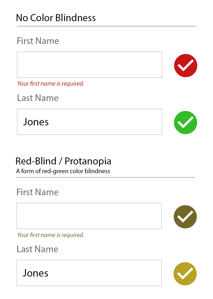
    Check Your Design’s Color Contrast

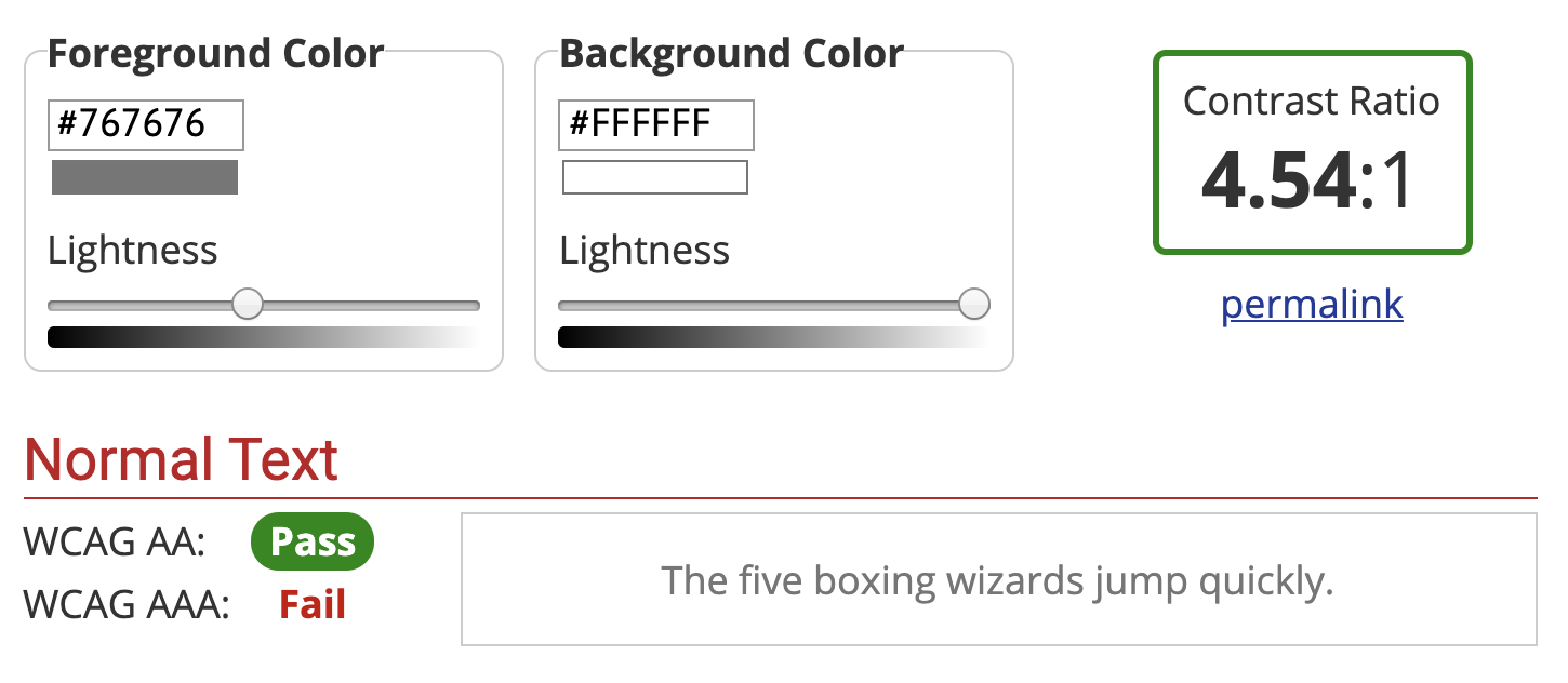
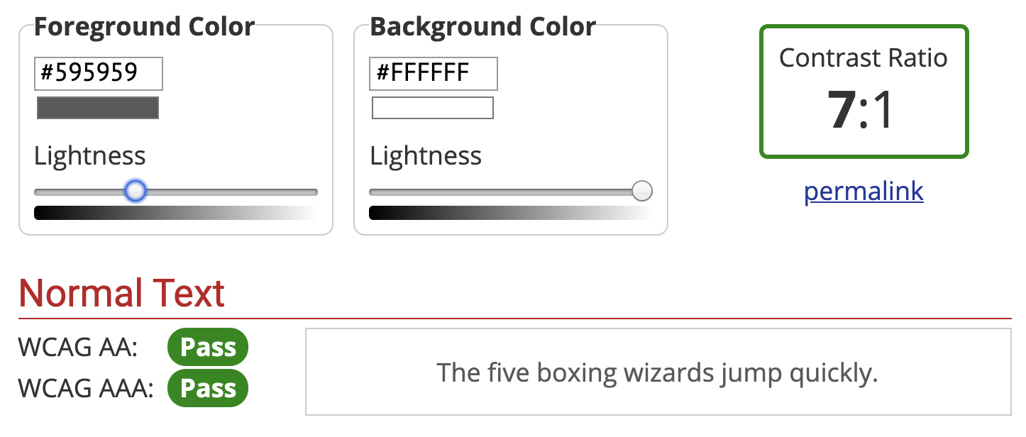
    Shoot for at least a contrast ratio of 4.5 to make sure people can easily read your content. Use this contrast ratio tool to test your color combinations.

    For example, I just checked my link contrast for the first time, and it’s only 2.2. I need to change the color, even though I spent waaaaay too long picking out the one I felt was best for the design. Poor me…

    Give All Form Fields a Label

    Since getting into web accessibility, I’ll turn on my screen reader and test sites when I’m ordering something. It’s amazing how difficult to use some of them are. For example, if a site only uses placeholder text to communicate a text input, the screen reader reads to me “Edit text, blank.”

    That’s it. “Edit text, blank.”

    So, if I was trying to fill out this form without seeing it, all I’d know is that I can edit text, and that the field is currently blank. Not very helpful as to what I should actually type.

    Here’s a better way to do it:

    <label for="email">Email</label>
    <input id="email" name="email-address" type="text">
    

    Or, you can wrap the label, but make sure to still use the ‘for’ and ‘id’, as not all screen readers handle it right without it.

    <label for="email">Email
        <input id="email" name="email-address" type="text">
    </label>
    

    Make sure the label for=”” and input id=”” names match. That tells screen readers that this label is for that input. Now, when a screen reader announces that input, it’ll say, “Email. Email, edit text.”

    Much better.

    Don’t Use maximum-scale=1 in your Viewport Meta Tag

    Ever been to a site on an iPhone where you wanted to pinch-to-zoom to see an image larger, but it didn’t work? It’s probably because maximum-scale=1 was used.

    maximum-scale=1 removes the ability for users to zoom in on the page. Start zooming on a few random pages on your smart phone. It’s unfortunate how prevalent this issue is.

    A better way to do it is to set the initial-scale, then let your user decide if they want to zoom or not. This is the meta viewport code I use on my sites.

    <meta name="viewport" content="width=device-width, initial-scale=1">
    

    This issue highlights a good rule of thumb: Don’t remove features that are meant to improve accessibility.

    Don’t Remove Focus Outlines on Links

    I’m guilty of this. On most of my early sites, I wanted to remove those “ugly” outlines that appeared after you clicked an internal link.

    “I don’t use a keyboard to navigate the screen, so my users don’t use keyboards either!” I thought.

    For those who don’t, having a slight outline to show tab focus doesn’t make them fly into a rage and smash their fists on their computer. For those who do use a keyboard to navigate, removing the focus makes the website significantly less usable.

    The pros/cons of this are pretty clear. Remember, don’t remove features that are meant to improve accessibility.

    Don’t Open Links in New Tabs

    SEO, keywords, link juice, umm… mumbo jumbo…?

    It may come as a shock to you, but, I’m not an SEO person. So, I don’t know the implications of not using target=”_blank” to open external links in a new tab. But, I do know that when you use a screen reader and you click on a target=”_blank” link, it’s really vague that you just opened a new tab. It’s really easy for it to slip by you, or not be announced, so you don’t KNOW you’re on a new tab.

    Here’s the process, as I imagine it:

    1. Click link.
    2. Link opens in new tab, but you don’t know you’re on a new tab.
    3. You read for a minute on the new tab.
    4. All done. Time to go back to the previous page.
    5. *Do keyboard shortcut for going back in the browser*
    6. *Computer doesn’t do anything, because… there is no going back.
    7. *Reflect on the heaviness of this deeply meta situation*
    8. *Eventually, hopefully, realize you’re on a new tab and use the tabs to navigate to where you were*
    9. *Say a short-but-sweet curse upon people who code links to open in new tabs*

    So, yeah, don’t do that to people. Unless you like being cursed.

    Full disclosure – I still do this from time to time. If anyone who extensively uses a screen reader reads this article, can you do me a favor and let me know your opinion on this?

    Use ARIA Landmark Roles

    ARIA roles give a little extra info to screen readers. Some people say you only need to use them when the HTML5 semantics don’t already communicate it.

    For example, those people argue that if you’re marking up your navigation with <nav>, then you don’t need to do <nav role="navigation"> because you already communicated that the element is a navigation with the HTML5 semantics.

    However, the semantics only go as far as the screen reader program wants to follow those semantics.

    “But,” you say, “they should follow the rules! I don’t want to write extra code when they should follow the rules!”

    “Now, gentle reader,” I soothe, “let me tell you a little story about Internet Explorer.”

    Let’s actually not do that. But, overall, it’s a minor inconvenience to communicate the information twice and hope all screen readers follow whichever semantics they do use correctly.

    Here’s an example of how to markup most websites with ARIA roles:

    <header role="banner">
    
      <nav role="navigation">
        <!-- your navigation -->
      </nav>
    
      <form role="search">
        <label for="search">Search</label>
        <input type="search" id="search" name="search">
        <input type="submit" value="Search">
      </form>
    
    </header>
    
    <main role="main">
      <!-- show 'em that sweet, sweet content -->
    </main>
    
    <aside role="complementary">
      <!-- Hey! I want you to see this stuff, but this isn't why you're here. -->
    </aside>
    
    <footer role="contentinfo">
      <!-- I'm the footer, where the copyright, contact info, and whatever else you want to jam down here goes -->
    </footer>
    

    Pretty painless stuff.

    Add Extra Screen Reader Content to Give Context

    Our visual designs often use space to give meaning and relationships between items. A screen reader can’t interpret our intentions, just what’s in the content. So, read through your site and ignore the visual layout (ideally, read through the source code). Does it make sense without those icons? If not, add some content, but visually hide it so it doesn’t clutter up your design.

    To visually hide content but still let screen readers read it, add this to your CSS file:

    /* Text meant only for screen readers */
    .screen-reader-text {
        clip: rect(0 0 0 0);
        overflow: hidden;
        position: absolute;
        height: 1px;
        width: 1px;
    }
    
    .screen-reader-text:hover,
    .screen-reader-text:active,
    .screen-reader-text:focus {
        background-color: #f1f1f1;
        border-radius: 3px;
        box-shadow: 0 0 2px 2px rgba(0, 0, 0, 0.6);
        clip: auto !important;
        color: #21759b;
        display: block;
        font-size: 1em;
        font-weight: bold;
        height: auto;
        left: 5px;
        line-height: normal;
        padding: 1em 1.6em;
        text-decoration: none;
        top: 5px;
        width: auto;
        z-index: 100000;
    }
    /* This code is taken from the Underscores WordPress theme and then adjusted from code from... I can't remember. Can anyone help me here? */
    

    Then, whenever you want to add content for screen readers to give context but hide it visually, just add the “screen-reader-text” class to your element and you’re done!

    <h3 class="screen-reader-text">Connect with Me on Social Media</h3>
    
    <ul class="social-icons">
        <!-- social media icons here -->
    </ul>
    

    Hide Unnecessary/Repeated Content from Screen Readers

    In the same boat as hiding content visually but showing it to screen readers, sometimes we need to hide content from screen readers that’s really helpful in our visual designs.

    For example, I like giant images, icons, and pull-quotes (repeated content) as much as the next designer, but, when using a screen reader, it doesn’t add to the content. Fortunately, it’s really easy to hide it from screen readers. Just add this code to any element you want to hide.

    role="presentation" aria-hidden="true"
    

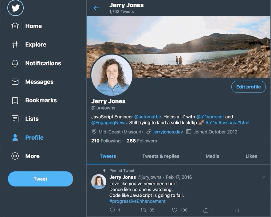
    Here’s the markup I use for my social media icons in my footer. First, I use the screen-reader-text class (example earlier in the article) to hide “Connect with Jeremy Jones” because the context of the social icons suggest that to users who can see it, then I hide the social media icons from screen readers and offer them the social media site name instead. Here’s the code:

    <h3 class="screen-reader-text">Connect with Jeremy Jones</h3>
    <ul class="social-icons">
        <li class="twitter">
            <a href="https://twitter.com/juryjowns">
                <i role="presentation" aria-hidden="true" class="icon-twitter"></i>
                <div class="screen-reader-text">Twitter</div>
            </a>
        </li>
    </ul>
    

    I’ve also written a tutorial on creating accessible pull-quotes that uses this method.

    Use Skip to Content Links

    Using our “screen-reader-text” class above, we can now add a visually-hidden link that allows people on screen readers to skip over the header and go straight to the good stuff. Otherwise, when using a screen reader, you have to cycle through the whole header and navigation each time you go to a new page.

    Here’s how to do it:

    <a class="screen-reader-text" href="#main">Skip to content</a>
    
    <!-- logo & navigation -->
    
    <main id="main" tabindex="-1">
        <!-- sweet, sweet content -->
    </main>
    

    The tabindex=”-1″ and linking to the HTML5 main element is important, unfortunately, to fix a bug in Chrome.

    Test it With a Screen Reader

    If you’re on a Mac, fire up VoiceOver by pressing Command+F5.

    Control+Option are called the VO keys. When interacting with VoiceOver, you pretty much always press Control+Option and another key, so VO = Control+Option. Here are the key things to use when testing a website with VoiceOver:

    • VO+Space = Click
    • VO+Right Arrow = Focus next item (basically like a tab)
    • VO+Left Arrow = Focus previous item (aren’t you glad you didn’t remove those focus outlines?)
    • VO+Shift+Down Arrow = Interact with area. For example, if you click a tab, you need to use this to get into the content of the page. Or, just use your cursor to click the logo or a navigation link to bring the focus onto the content if you get stuck mashing keys that don’t seem to do anything.
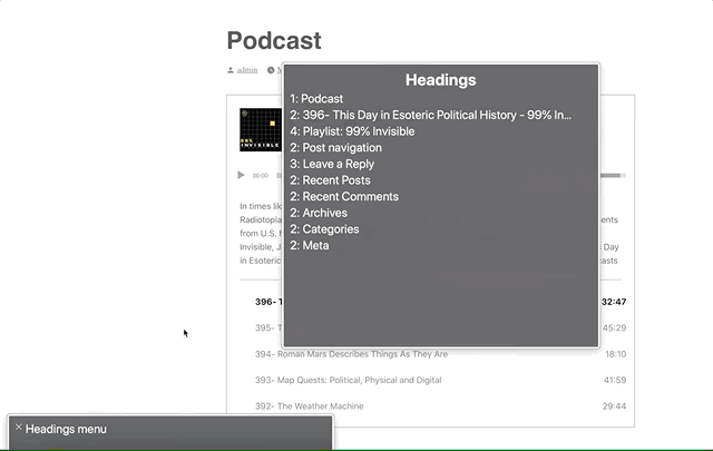
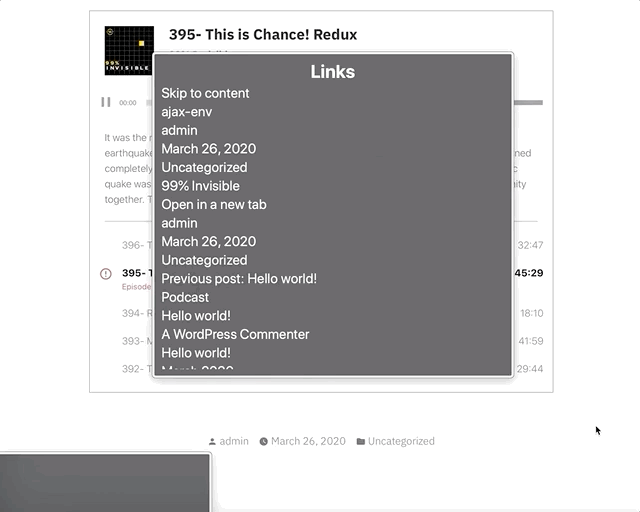
    • VO+U = Opens a “rotor” that lets you scan through headings, links, and some other stuff. Kind of like an automatically generated table of contents. Use the arrow keys to navigate through them. Definitely worth checking out.

    If you want to learn more, WebAIM has a guide on using VoiceOver.

    If you use semantic HTML, you should be happy to find that 95% of your site works just fine. If you don’t use semantic HTML, well… you’ll see.

    For New Projects, Design Content-First

    This tip isn’t a quick tip for retrofitting an accessible site, but if you care about accessible sites, then I can’t stress this enough. If you design by creating your content first, then code your HTML before doing any visual design, your site is going to be more accessible without even trying. Well-coded, semantic HTML is accessible out of the box.

    Learn More

    It’s hard, if not impossible, to make a perfectly accessible website for 100% of users, but that doesn’t mean we shouldn’t try. You can learn a lot more tips and info on web accessibility by checking out the Accessibility Project.

    Are there any great tips that I missed? Do you think I’m giving bad advice? I’m not looking to be right, I’m looking to provide a really useful article to help people easily make their websites more accessible. Let me know in the comments or on twitter if there’s something I can do to improve it.